
Trade Redesign
Bitkub’s trading screen — the core of the app, where users actually buy and sell — hadn’t changed in any meaningful way for years. In that time the major global exchanges converged on cleaner, more standardized layouts, and ours had started to feel dated by comparison. The goal was to determine whether a modernized layout would genuinely improve the experience, without breaking the habits of the traders who use this screen every day.
Product Overview
I led the substantive design work end to end: the research, the synthesis, and the design of both layout directions plus all the refinements that came out of testing. Another designer picked it up for the developer handoff — the flow-mapping and design-token QA. I worked alongside a Product Owner (requirements and success metrics), a UX Design Manager (design direction), and a UX Writer (interface copy) throughout."
Ran competitor research, user interviews, and usability testing
Synthesized findings from Maze.io heatmaps and survey responses
Designed both layout concepts end to end (A & B)
Refined and validated the flows through iterative testing
Responsibilities
Research Process
Hypothesis
I went in with a hypothesis: that the layout might be hurting users. Around a third of our traders — per the intake survey — also use platforms like Binance, which offer more trading pairs (USDT, where Bitkub was THB-only) and advanced features like futures, so many users are fluent in other apps' conventions. My specific worry was that our different layout, especially the input-field order, could cause errors — entering the right value in the wrong field out of habit. I set out to test that rather than assume it.
I grounded the redesign in real user behavior rather than our own assumptions, across three streams:
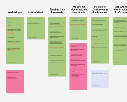
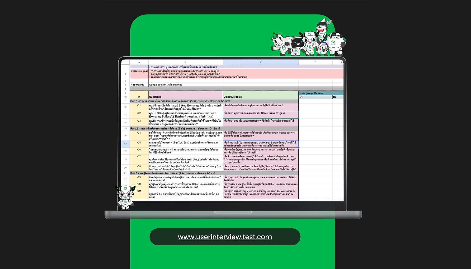
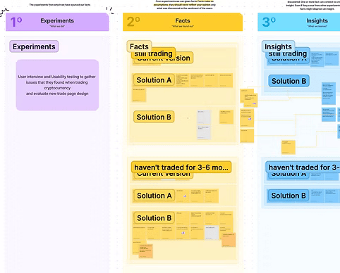
User interviews: I sat down with 8 general-level traders to check the assumptions coming out of the competitor scan and the social listening against real user behavior.
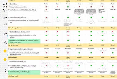
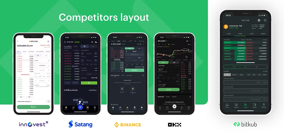
Competitor research: I looked at how major exchanges structured their trading flows to spot recurring patterns, then built a pros-and-cons breakdown comparing each competitor’s approach.
Social listening: I pulled real user sentiment from Pantip threads, YouTube comments, and Facebook groups to get a read on how people talked about the trading experience outside of a formal research setting.
Methodologies
Key insights
Synthesizing the three streams, four problems came up consistently:
Bottom sheet — order entry lived in a sheet that slid up over the chart and order book, covering the market information users needed mid-trade and adding extra swipes to every order
Overlong screen — chart, order book, and entry fields stacked vertically, forcing users to scroll back and forth to place a single trade
No live balance check — insufficient funds only surfaced through a dialog after submitting
Missing match info — a limit order doesn’t always fill at once, but the UI never showed the matched percentage, so users couldn’t tell whether an order had executed, partially filled, or was still pending
Three further differences from competitors needed validation with users rather than assumption — the order book (not the price graph) as the landing view, the trade-entry field sequence, and orders staying invisible until a manual tab switch. The interviews sorted these clearly:
Confirmed — the bottom sheet was consistently irritating, and users wanted the balance warning inline rather than as a dialog
Not actually issues — the unfamiliar field order didn’t bother anyone (users had learned Bitkub’s sequence), and a confirmation dialog alone was enough after a trade
Traders also spent far more attention on the price graph than the order book — and, notably, saw Bitkub as more beginner-friendly than competitors: everything denominated in baht with no mental currency conversion, direct Thai bank deposits, and a deliberately simpler feature set. The takeaway wasn’t “copy the competitors” — it was “be careful what you change.”
Prioritization & Prototyping
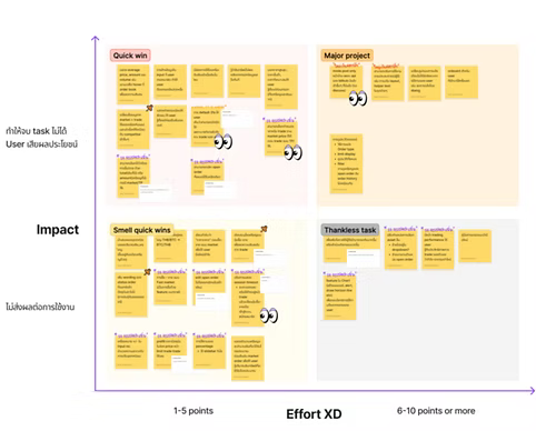
With a long list of possible changes, I ran everything through an Activity Priority Matrix — impact versus effort — reviewed with the Product Owner. The restraint was deliberate: real money moves on this screen, and users weren’t struggling with the existing layout, so disruption had to be earned by evidence. Confirmed pain that was cheap to fix went first; validated non-issues were left alone.
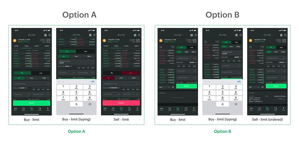
Rather than bet on one direction, I built two prototypes carrying the same core fixes and tested them against each other:
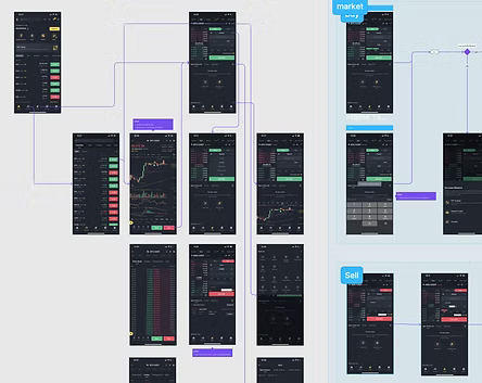
Option A — stayed close to the existing layout
Option B — moved toward competitor conventions
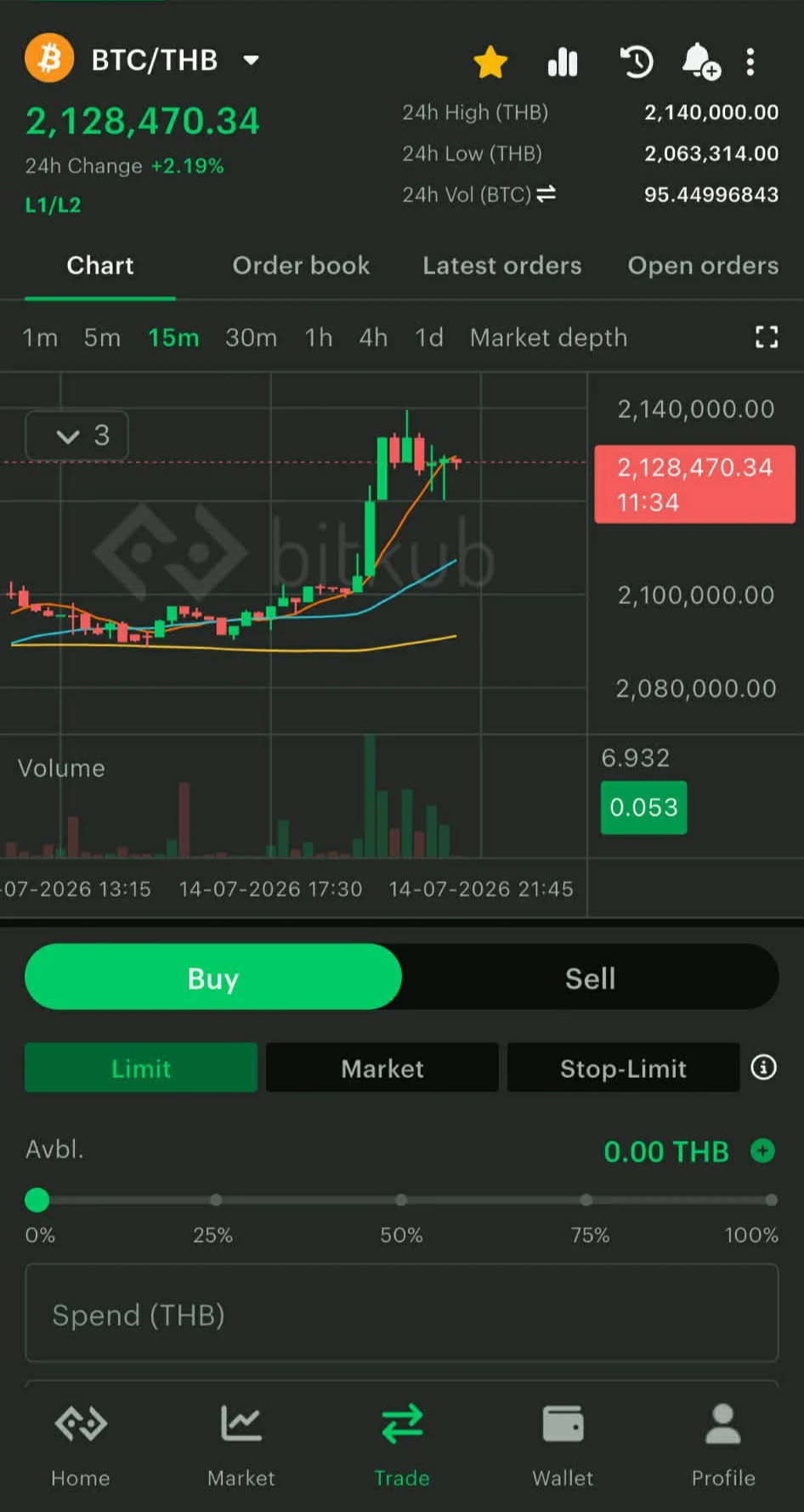
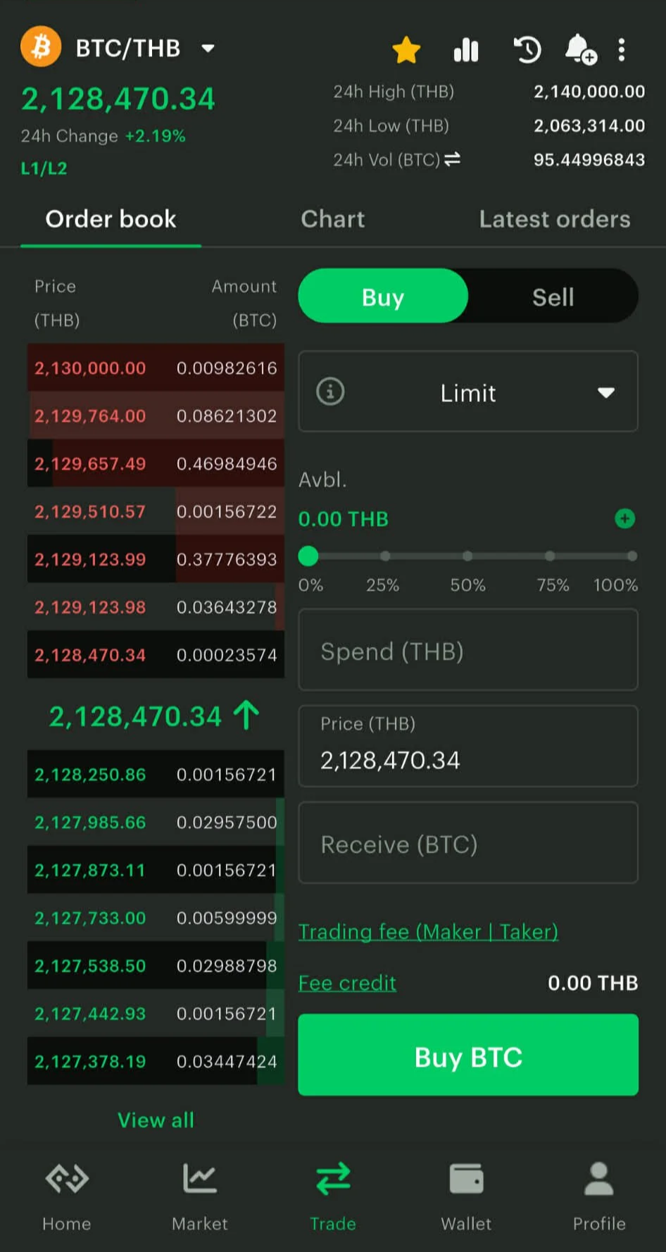
Shared core changes: order entry moved directly onto the screen (bottom sheet removed), inline balance validation on blur, matched percentage surfaced on open orders, the price graph as the default landing view, a shorter screen with fewer order-book rows, and the familiar field sequence preserved. I worked with the UX Writer on the validation and error copy, since wording matters when the message is that a user’s money can’t move.
Testing & Data
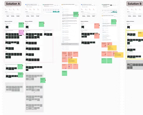
I turned both concepts into clickable prototypes and tested them through Maze.io with 213 users who had previously traded on Bitkub — recruited by email invitation with an incentive, screened by a pre-test survey for trading experience, and given task scenarios mapped to the core trade loop and the specific changes made, so results were attributable. Maze captured success and fail paths, misclicks, time on task, and heatmaps.
On CSAT, Option A edged Option B, 8.04 to 7.50 out of 10 — close enough to read as “both directions viable” rather than a decisive winner. The fail-path and heatmap analysis became the refinement list.
Atomic Research & Refinement
A granular pass through the data surfaced specific issues, each with a concrete fix:
Keyboard covered the order book while typing → capped the push so only the active field moves
Percentage control was underused — the heatmaps showed people often weren't tapping it, which suggested it didn't read as interactive → replaced with a standard slider above the input
Layout felt cramped → given slightly more vertical room
Since both options scored close and each had a real constituency, we shipped both layouts and let users switch between them — which left one question open: which layout should be the default.
Launch & Outcome
These events were a company-wide initiative testing the app's key flows — buy/sell, deposit/withdraw, and the trade screen among them — each owned by a different designer. The trade screen was mine. So the headline scores are app-wide; the clean, trade-specific proof was the 213-person prototype test.
Pre-launch — Bitkub Meetup 2025 (71 participants)
CSAT 80.00% · SUS 68.20 · Task success 80.83%. The build defaulted to Option A, and one task proved pivotal: switching layouts unaided. Most users didn't know a second layout even existed, and nobody thought to look in the overflow menu where the switcher sat — so defaulting to the unfamiliar layout would strand users with no idea the old one was still there. On that basis, I recommended launching with the familiar layout as the default.
Launch — the default decision
Despite the finding, leadership launched with Option B, the competitor-aligned layout, as the default, to line up with the industry. The reaction was immediate and largely negative on Facebook — and, exactly as the research predicted, users couldn't find their way back. The default was reverted to the original layout, paired with a tooltip pointing users to the switcher — closing the discoverability gap the research had flagged.
Post-launch — Bitkub Summit 2025 (170 participants)
CSAT 82.90% · SUS 81.20 · CES 81.60. Held about two weeks after the revert, with the tooltip live, so the discoverability gap was resolved. SUS climbed from 68 to 81 — from the industry average into the excellent band — on the live product users had actually been using.




Recommendations & Trade-off
Shipping both layouts was a deliberate trade-off: extra design and engineering overhead, in exchange for letting existing users keep the flow they knew while offering a competitor-style option to anyone who wanted it.
The launch reaction is worth reading carefully rather than at face value — public comments skew toward complaint, so volume alone isn’t proportional to how the full user base felt. But it surfaced something real: users said in interviews that they wanted an industry-standard interface, yet reverted to valuing familiarity once that standard actually became the default. That stated-versus-revealed-preference gap — anticipated by the pre-launch research — is the most durable lesson from this project.
What I’d do differently: capture a baseline of the old design before launch, so the improvement reads as a proven delta rather than a standalone score; quantify the discoverability risk rather than flagging it qualitatively, so the
recommendation carries more weight in a leadership decision; and roll a new default out gradually rather than as a hard switch, letting behavior decide.