Jobwatch is the mobile counterpart of BigChange. It replaces manual planning and paperwork, providing a simple and efficient way to keep your office in total sync with your mobile teams. The app is mostly used by engineers and employees within the business.
Worksheets are the groups of questions that you can attach to a job and represent a paperless alternative to the documentation more traditionally used by mobile workers. Questions in the worksheets are presented as tasks in the JobWatch app for engineers to complete before and/or after certain jobs.
Most common worksheets include risk assessments and vehicle checks.
Tasks
Introduction
Team members
5 Product Managers
4 Developers
2 Product Designers
Discovery
Understanding how worksheets and tasks operate.
Speaking to Product Managers to understand the current pain points and gaps in functionality.
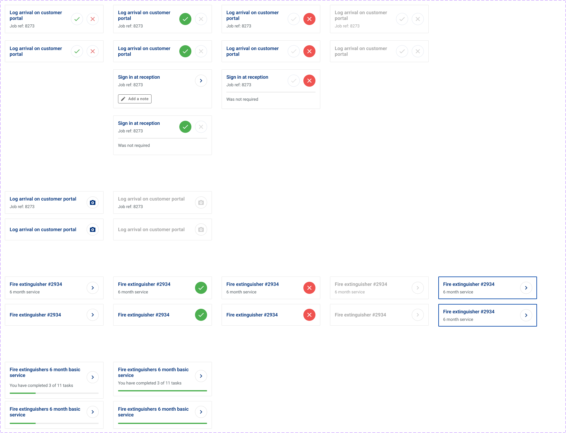
Confusing user interface. Unintuitive as there is no clear call to action in order to complete next steps.
Too many icons that do not have a clear call to action.
No clear progression when completing tasks within a worksheet.
The Problem
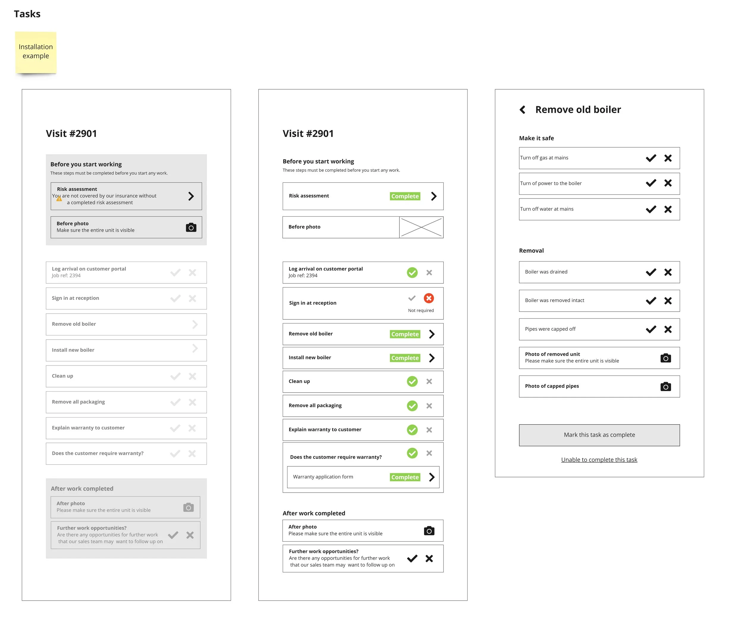
The tasks section of the JobWatch mobile app is poorly designed. It is filled with unclear and unintuitive icons that makes it near impossible for new users to be able to use effectively. This causes the users to have to go through a trial and error process in order to be able to achieve their goals. This is a major pain point as the main users of the tasks sections are the engineers and plumbers who are not necessarily tech savvy people.
Our goal is to make the process of completing tasks as streamlined as possible. We want to reduce the amount of possible errors as well as reducing the amount of time engineers need to spend on the app instead of actually doing the job.
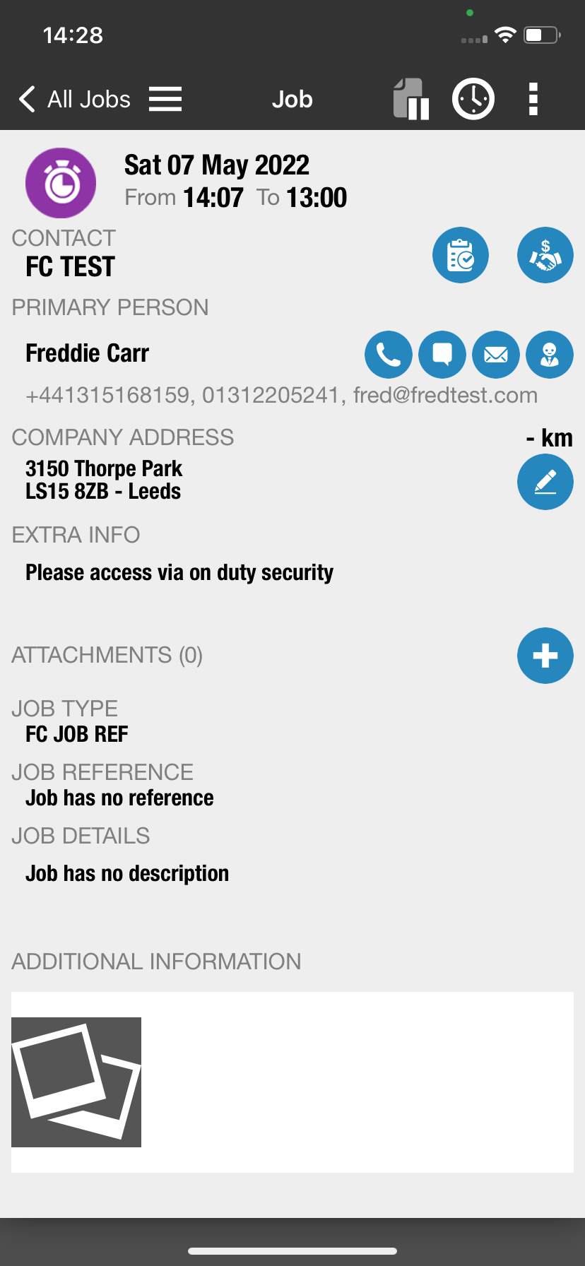
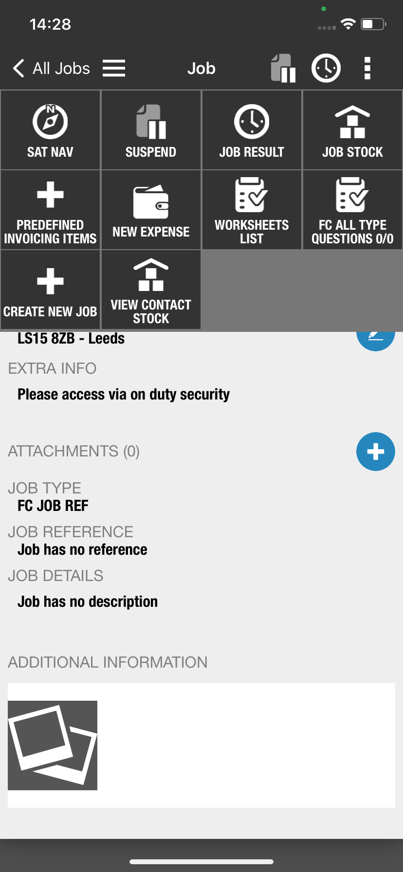
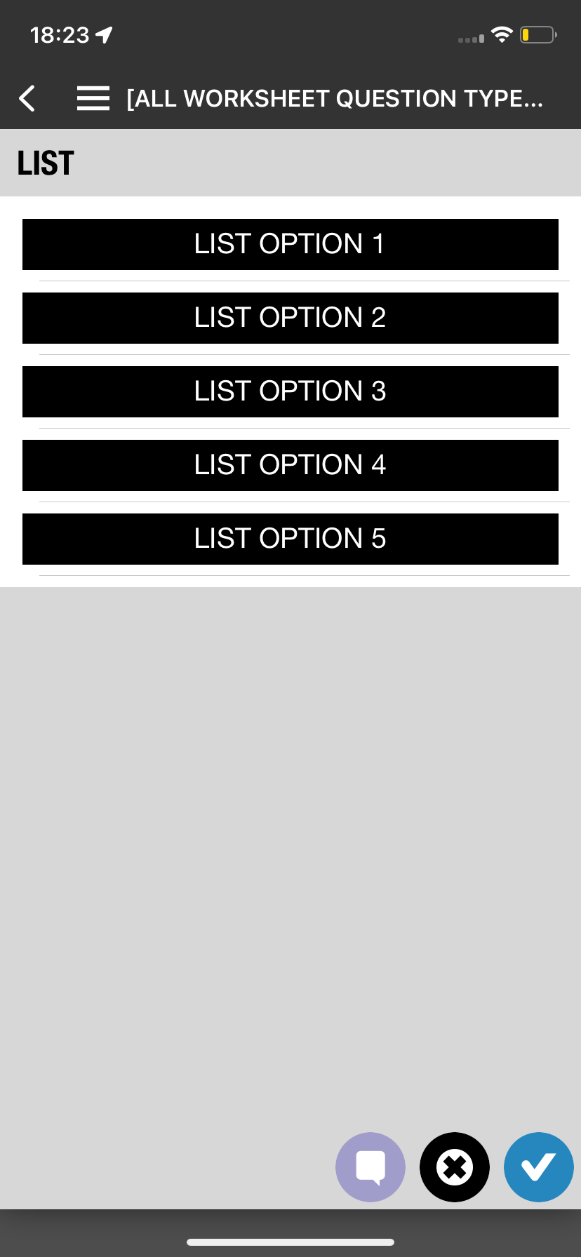
The Current UI
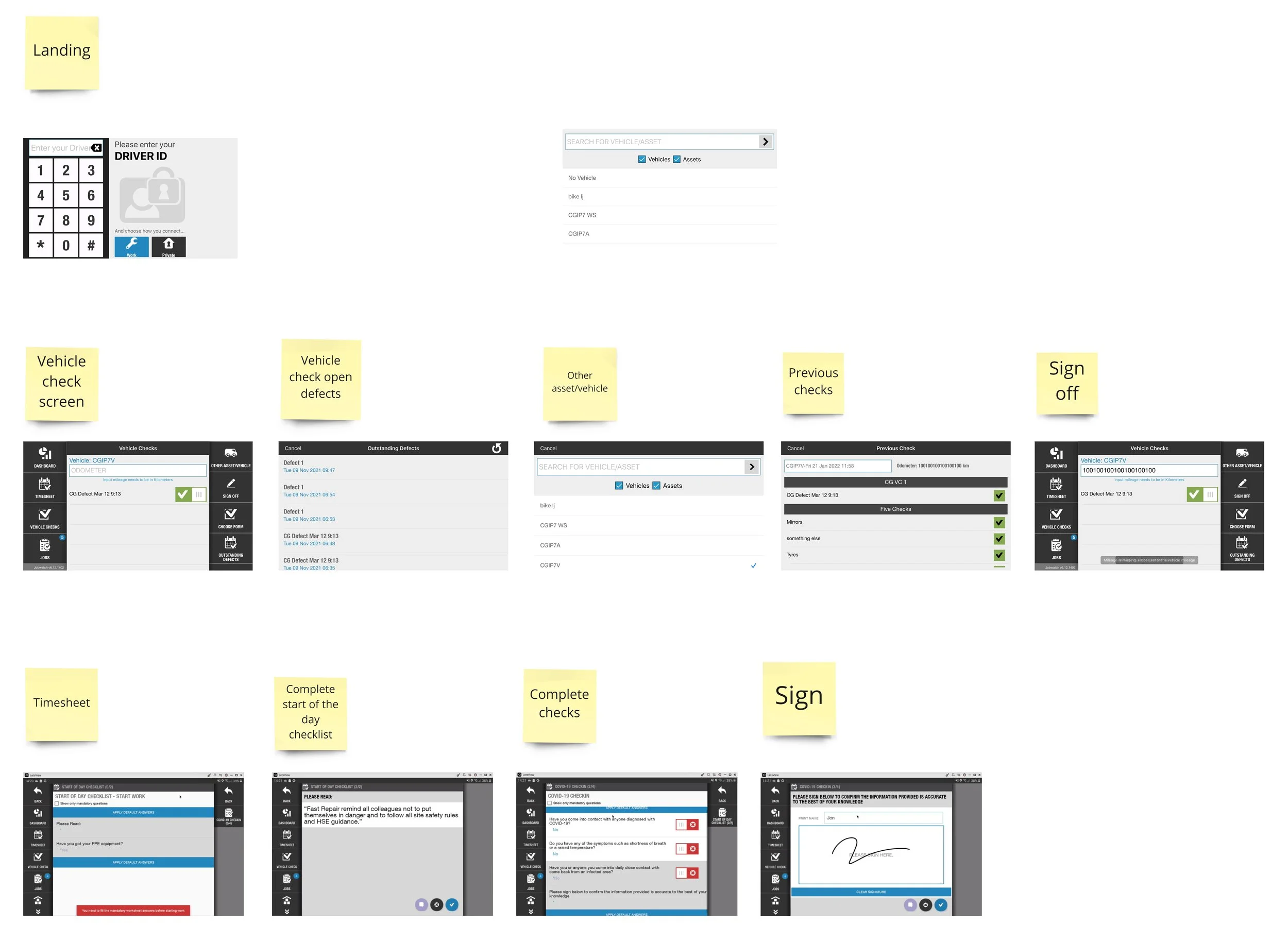
Ideate
Visualising how we can streamline tasks and make it simple for engineers.
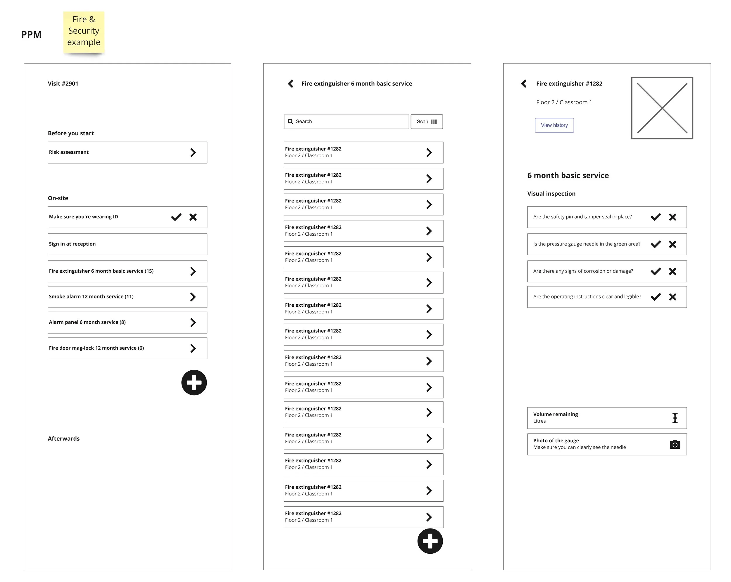
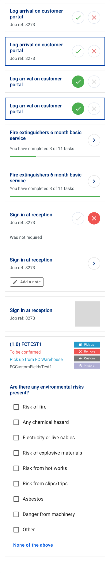
Creating a clear step by step progression as users complete individual tasks within a worksheet.
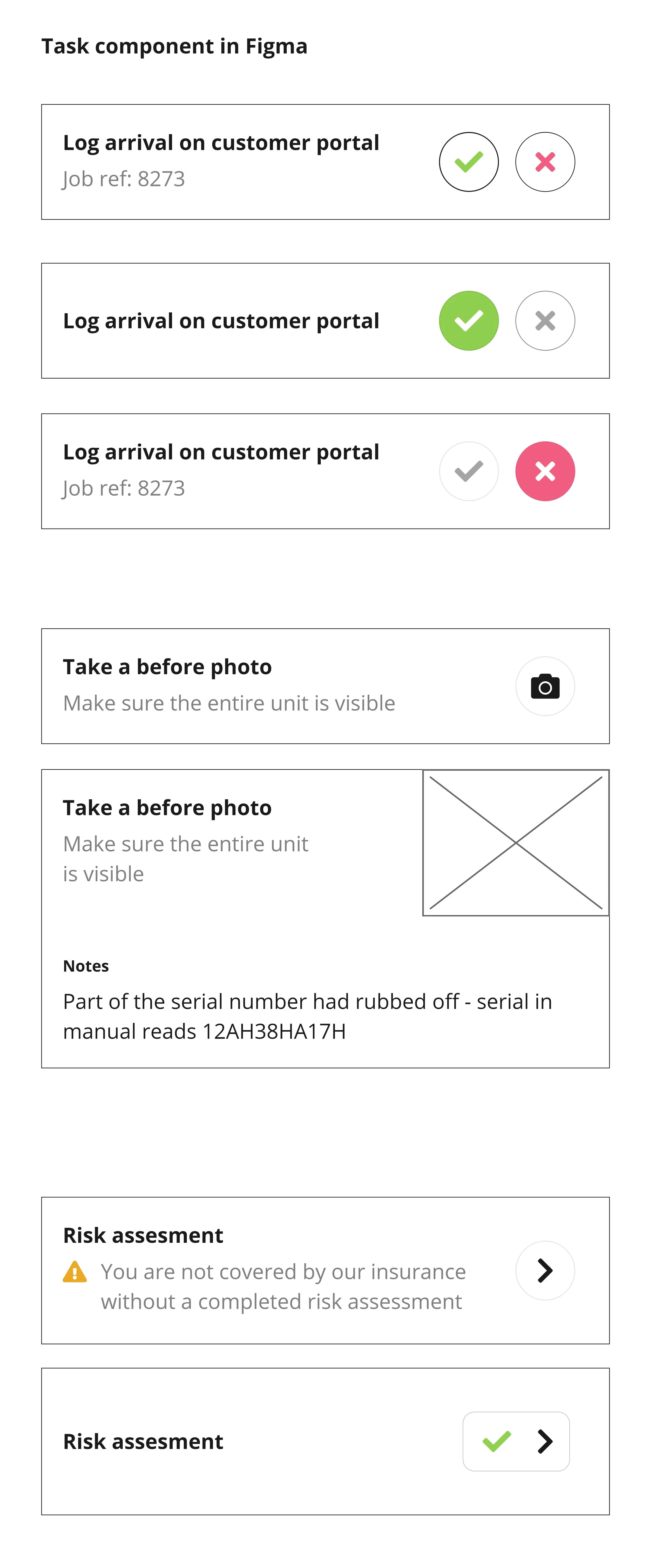
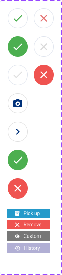
Easy to understand icons with a clear call to action.
Status and progress of worksheets to help users understand if they have missed any tasks within a worksheet
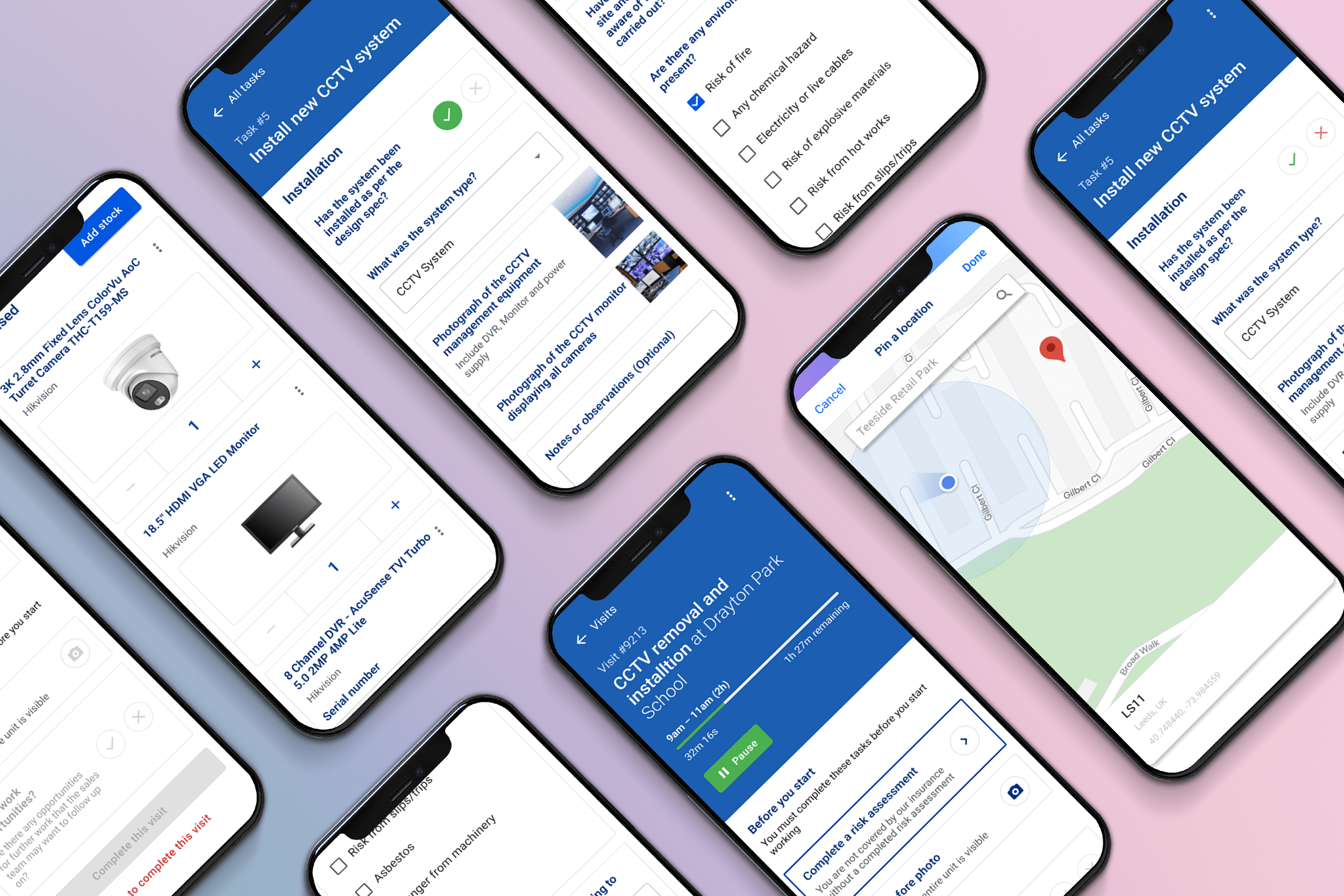
Initial Designs & Wireframes
Refine
Utilised MUI design system components in order to streamline to process for both designers and developers.
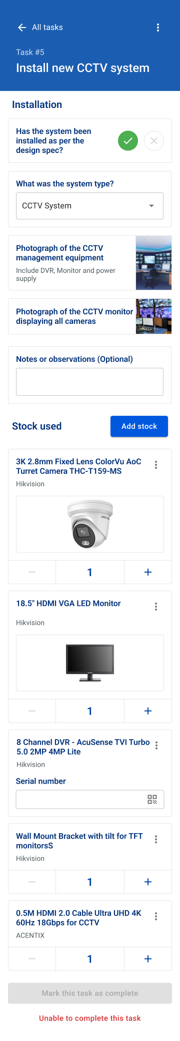
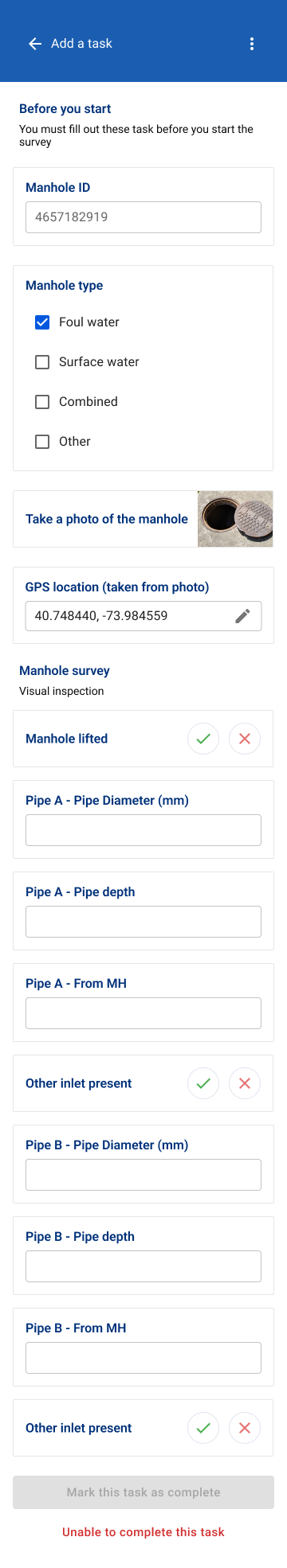
Created different types of job cards for specific tasks e.g. Yes/No questions, lists, text answers, etc.
Clear usage of iconography with easy to understand call to action.
Clean UI with clear indication of next steps and progress for users. This is done by highlighting the next task for users to do and graying out tasks that cant be completed before doing the highlighted task. Furthermore, each specific task includes supporting copies to further explain to users the call to action.
Developing The Design

Prototype
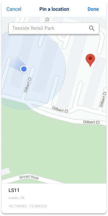
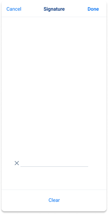
Additional contents included. This includes signature over for completing each worksheet, ability to edit gps location and pin from map, barcode scan, etc.
Added a section for stocks and non serialised items that are going to be used for the job. Straightforward UI of how each item can be added and editing its quantities.
Finishing touches


Test
The revamped Tasks section was rolled out to internal stakeholders and partnered companies for it to be tested in real life scenarios.
Results
25%
INCREASE IN CUSTOMER SERVICE RATINGS
“This new version of tasks has transformed how we work; with everything in one place and live information at our fingertips we’re more responsive and have increased contract win-rates.”
-Heatforce
First 30 Days of Launch
35%
INCREASE IN WORKFORCE PRODUCTIVITY
“The redesign of Tasks has allowed us to streamline our operations. Technicians are self-sufficient, there are fewer wasted hours and productivity is already up by 35%.”
-A&S Contractors