Permissions
-
This is where a collection of permissions are defined for the whole system. It is where a role or set of permissions are assigned to a specific users and groups.
The combination of permissions define a specific role’s ability to do something on the platform. Custom roles are also able to be set. The default roles includes basic user, admin, etc.
-
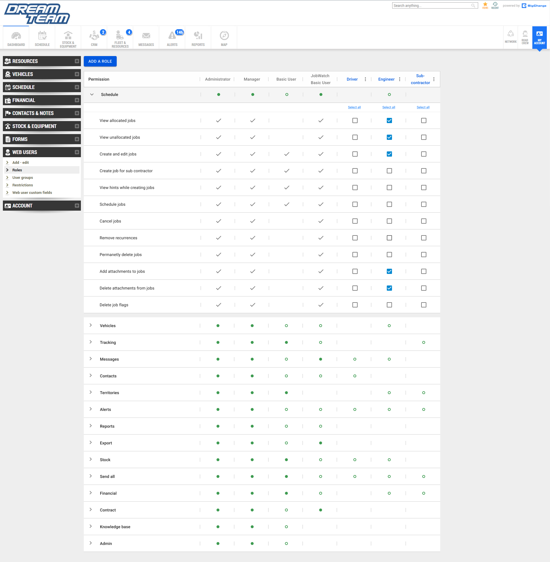
The permission and role page is poorly designed. There is no clear indication to differentiate the various types of permissions. This is a problem as each type can take up multiple rows. Users will have to keep scrolling down inorder to find their desired type. Furthmore, the table becomes cluttered once different specific roles keeps getting added to the system.
In combination, this makes the navigation and user experience rather poor.

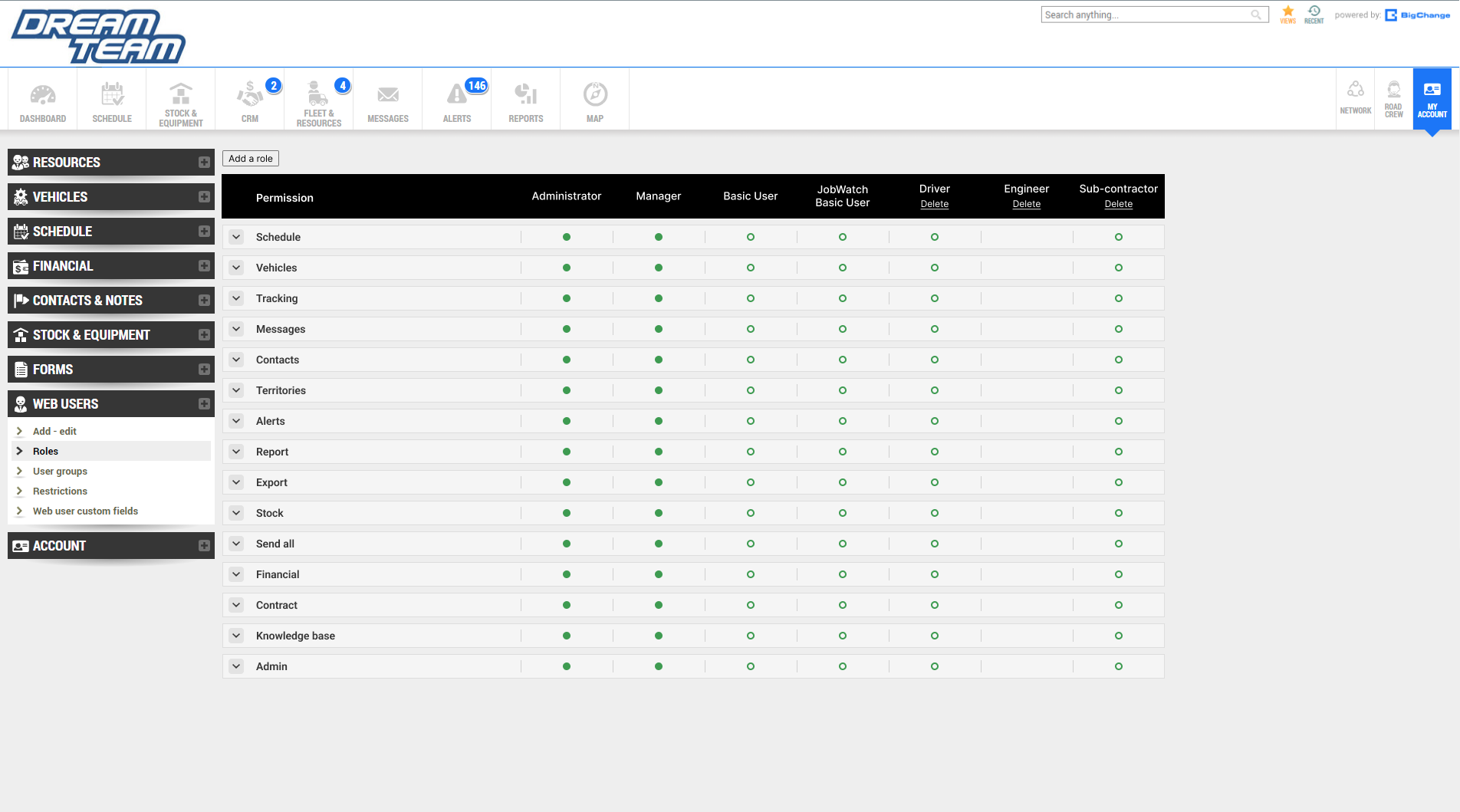
Current User Interface
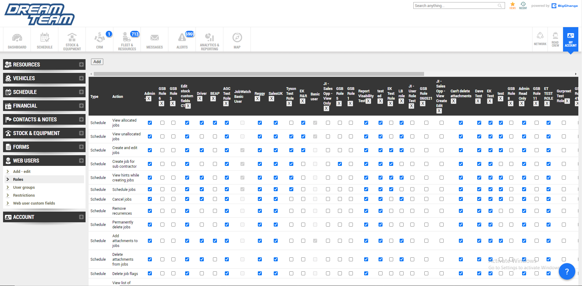
Poor navigation and user experience
Unsorted ‘types’ of permissions
Becomes cluttered when many roles get added to the system
Poor copywriting. ‘Type’ is a poor choice of word as new users are unlikely to know what it means.
Ideation
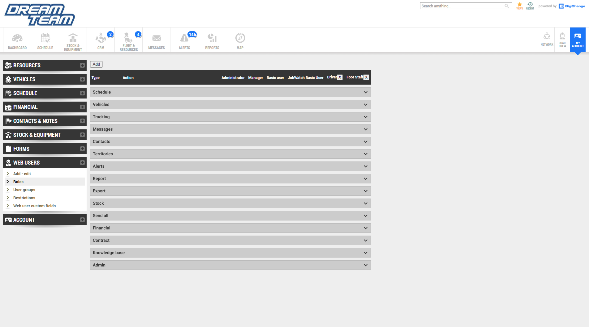

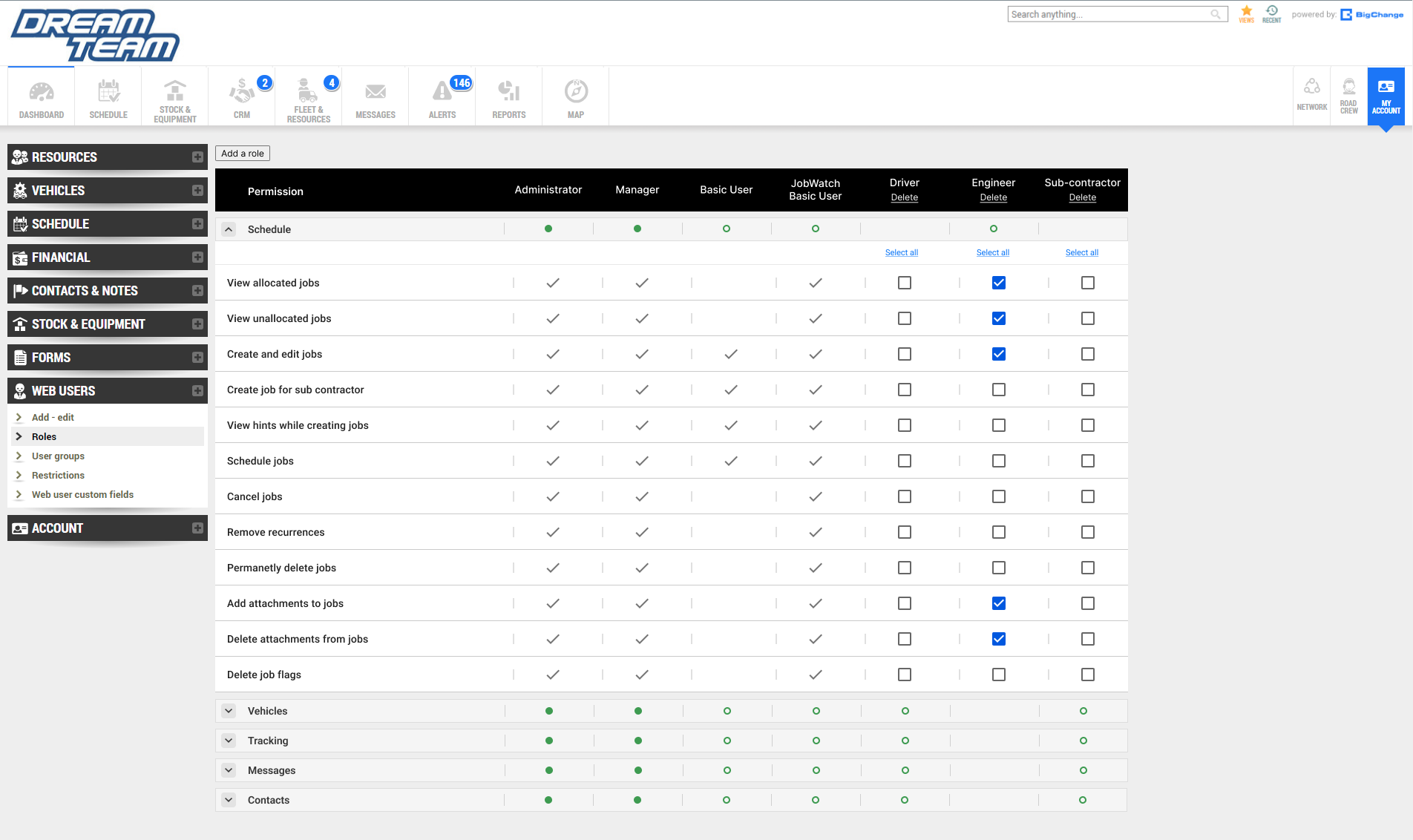
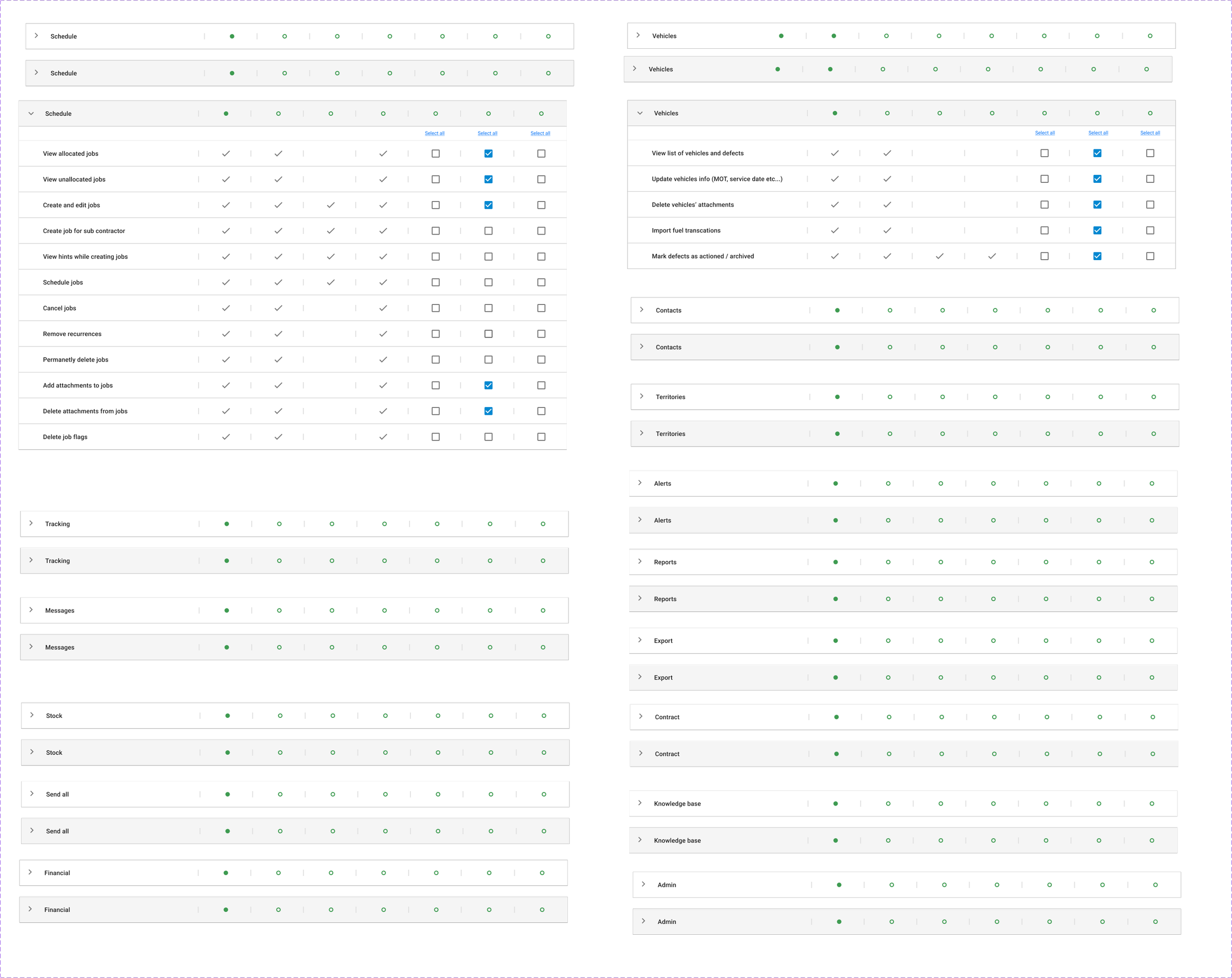
Sorted the ‘type’ into an accordion style menu so users can find their desired permission quickly and efficiently
Added check box infront of each permission so users can select them all at once.
Included check marks and hyphen icons on top of the accordions so users can see which permissions are currently active without having to click on them.
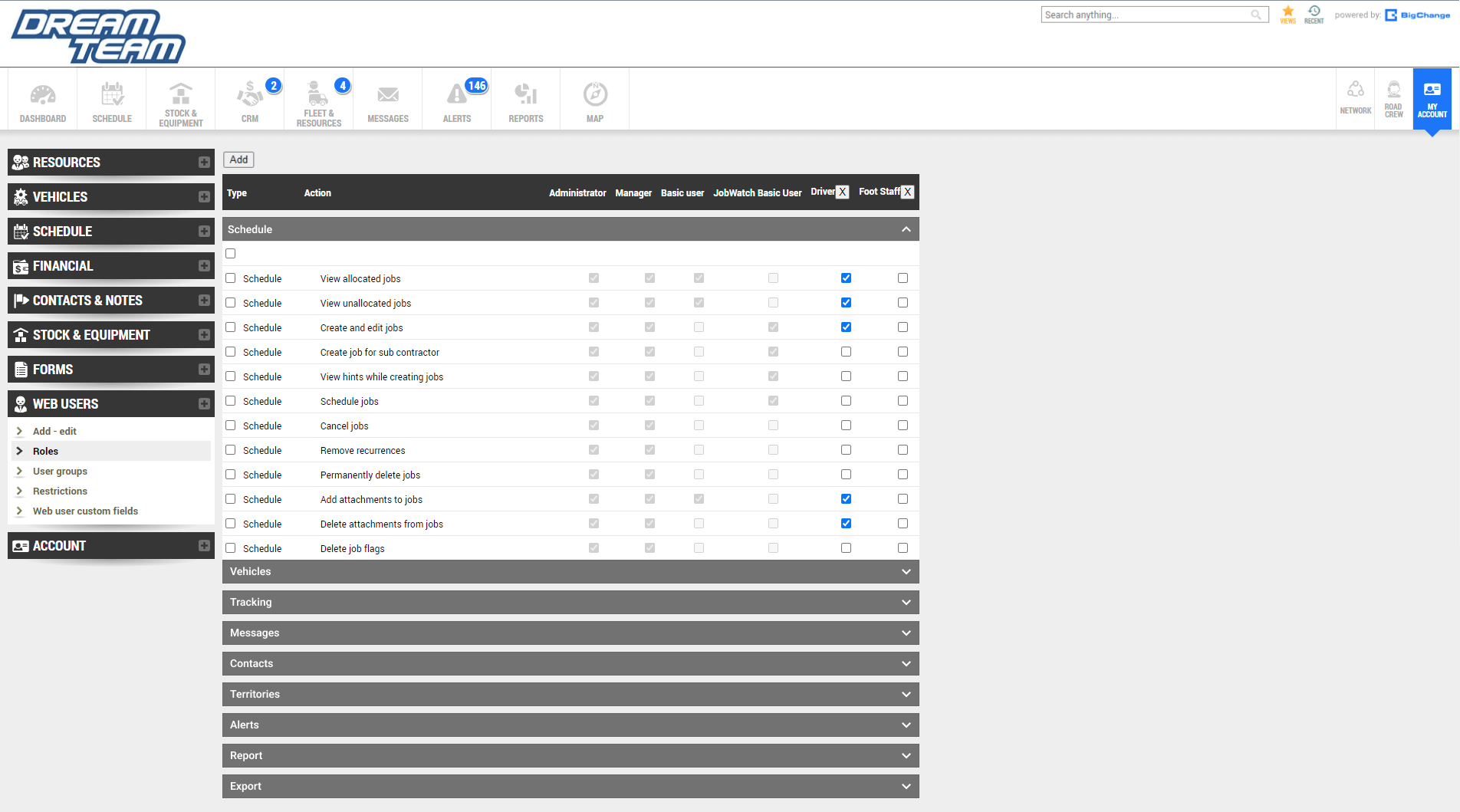
Developing the design
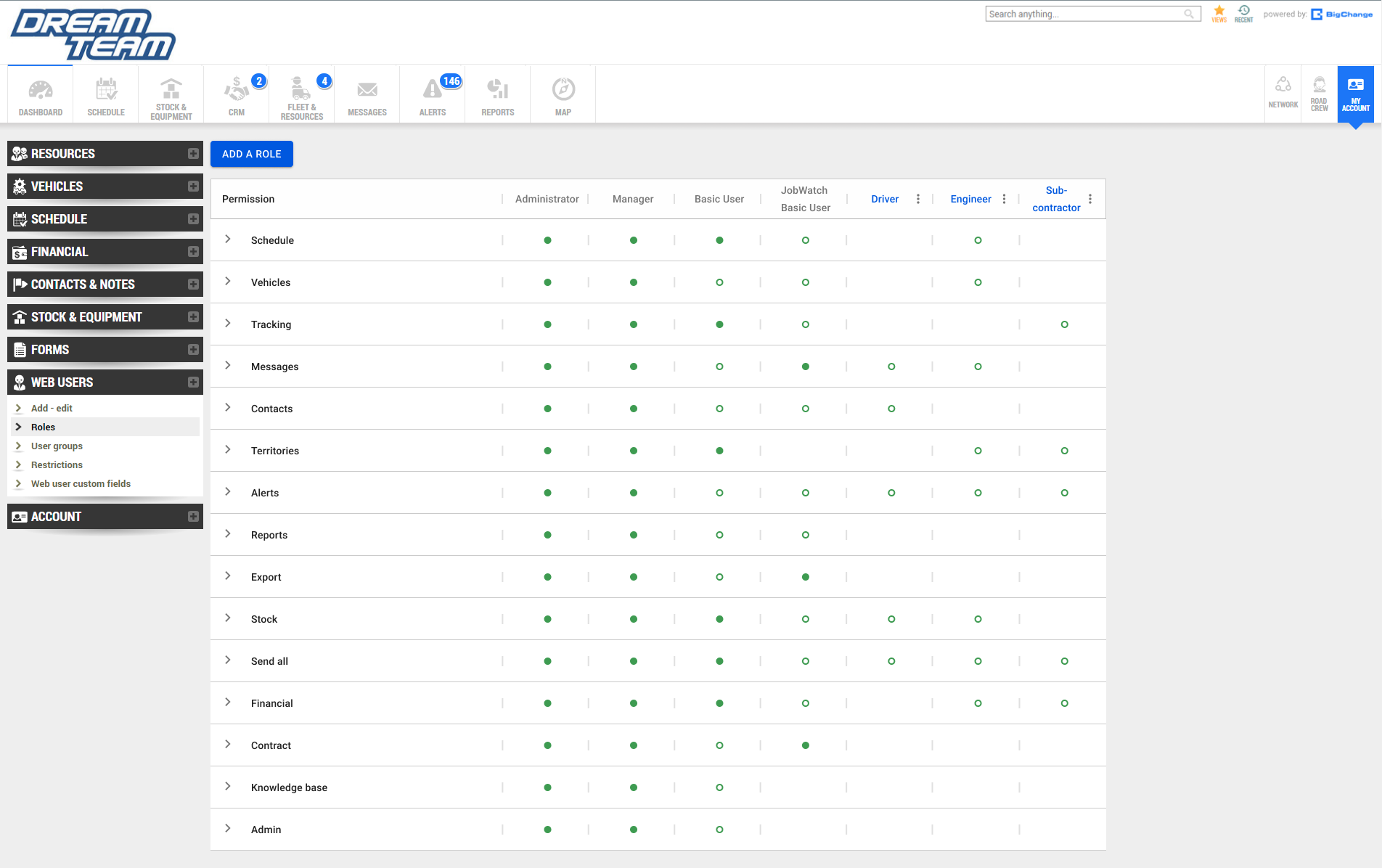
Utilised MUI design system components after disscussing with developers. This is because the company is transitioning to using Reactjs for building its user interfaces. The MUI design system is part of the React components library. This will help to streamline the proccess for both designers and developers.
Check mark and hyphen icons are changed to filled green dots or unfilled green dots. Filled dots means that all of the permissions in that column are active. Unfilled means only some are active. Empty means that they are all inactive. This is done in order to create less visual clutter.
Check mark and hyphen icons are now located inside the accordions. This is done to further explain the different states of the green dots in depth.
Greyed out premissions for roles that are default to indicate that these cannot be changed.
Included ‘select all’ buttons for editable columns
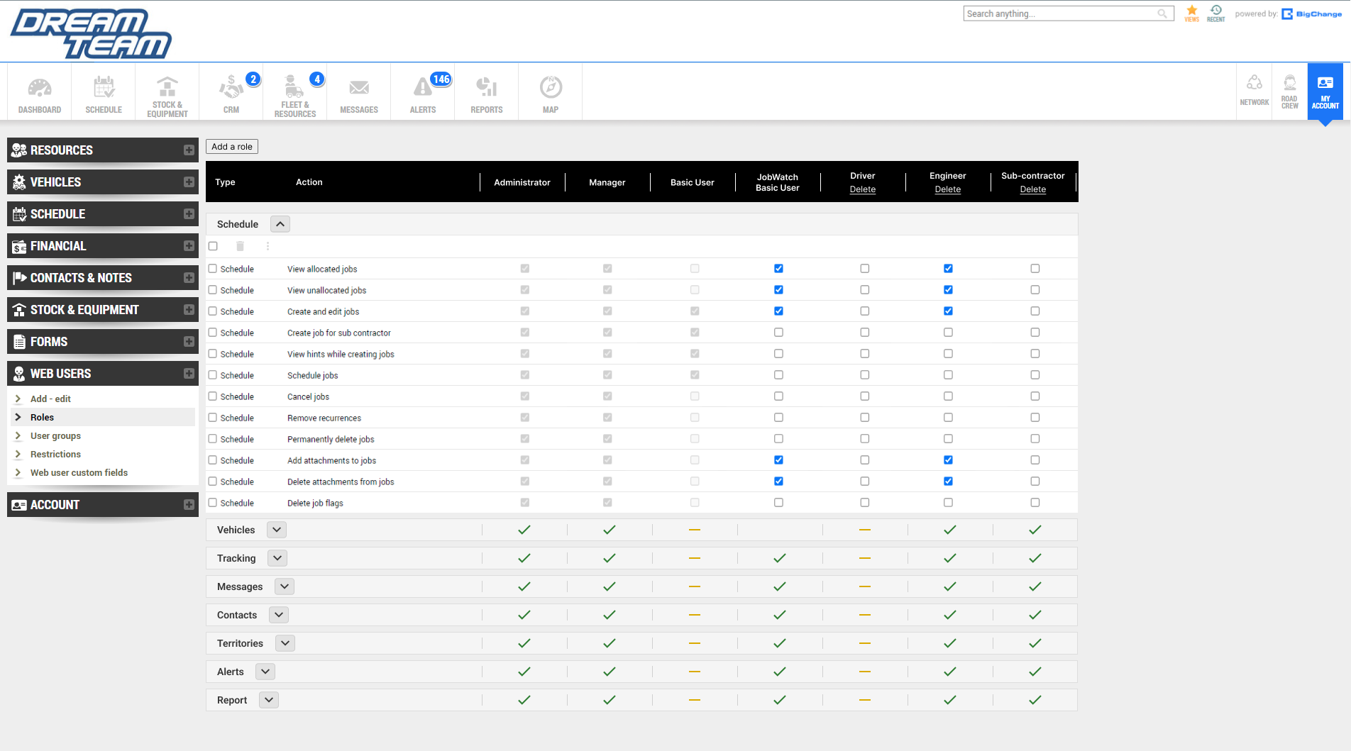
Finalising the design
Changed from grey to white in order to replicate the visual identify of the Import Hub north star design.
Added hover states which turns the permission from white to grey to indicate that it is being interacted with.
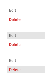
Ellipsis now includes edit and delete overlay as well as its hover states.
Changed the word ‘Type’ to permission.
Default roles are now greyed out in order to signify that they cannot be edited while custom roles are highlighted in.
Next steps…
Test the prototype with real users and measure success through time it takes to create and edit custom roles. The results will allow us to further refine and make changes based on the outcomes.