Permissions
Introduction
This is where a collection of permissions are defined for the whole system. It is where a role or set of permissions are assigned to a specific user and group.
The combination of permissions define a specific user's ability to do something on the platform. Custom roles are also able to be set. The default roles include basic user, admin, etc.
Team members
4 Product Managers
3 Developers
2 Product Designers
Discovery
The Problem
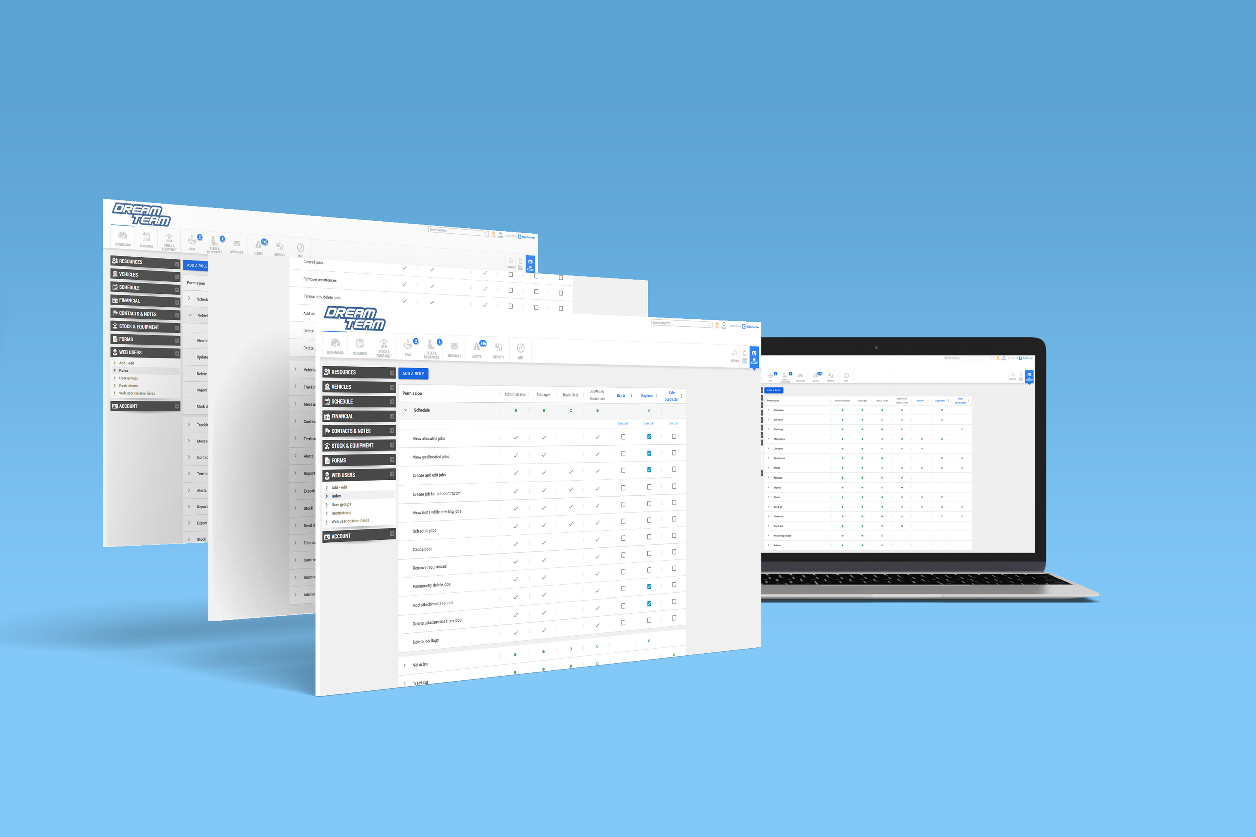
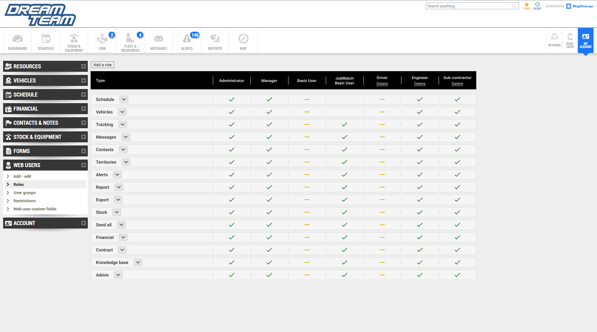
The permission and role page is poorly designed. There is no clear indication to differentiate the various types of permissions. This is a problem as each type can take up multiple rows. Users will have to keep scrolling down inorder to find their desired type. Furthermore, the table becomes cluttered once different specific roles keep getting added to the system.
In combination, this makes the navigation and user experience rather poor.
Too Much Information
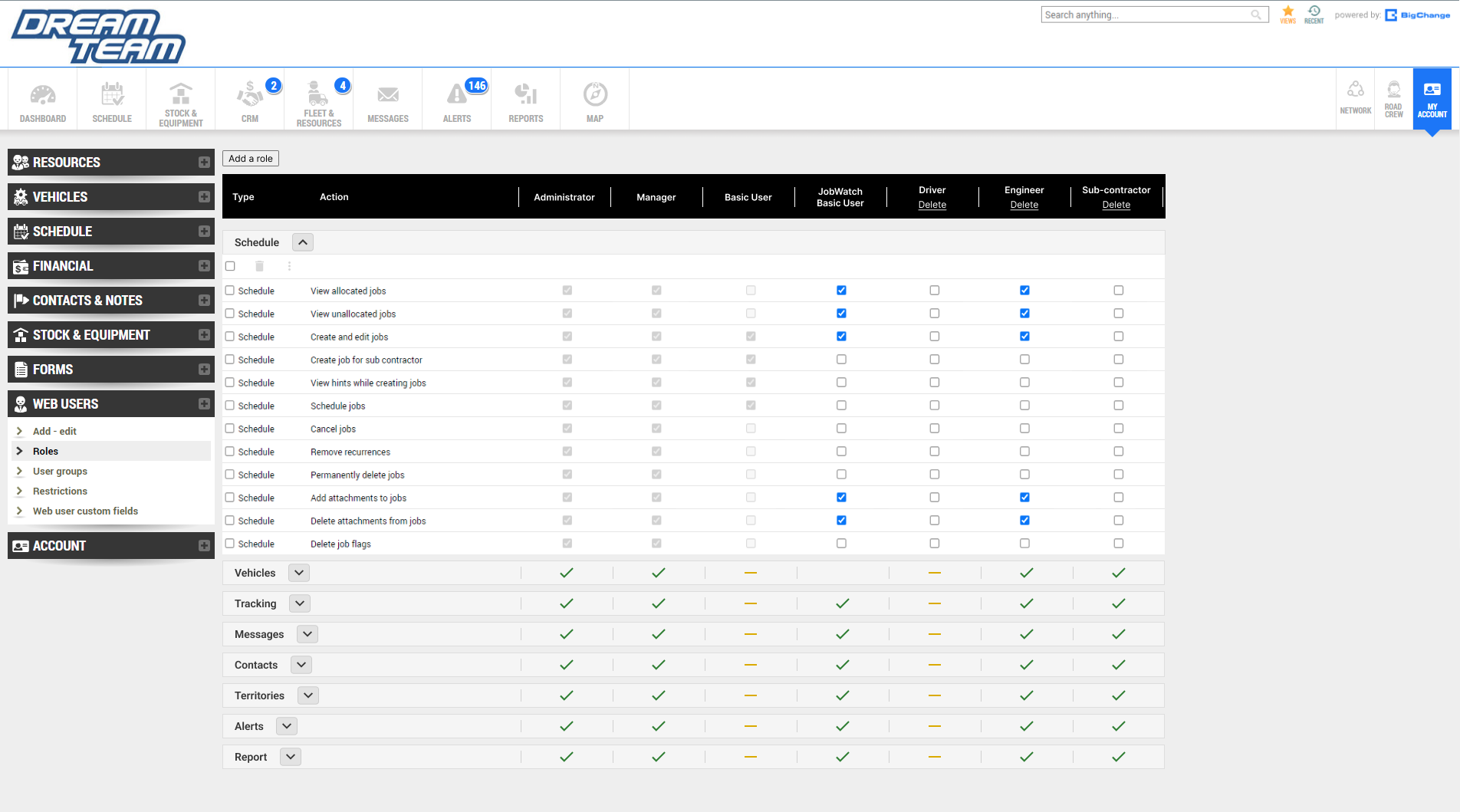
The layout and navigation of the feature is not clear and easy to use. This is due to how much information there is to take in for the users. There are many types of permissions with their own set actions that are presented to the user at once. Furthermore, information overload willl keep amplifying once more and more custom roles get added to the system. As a result, this user interface will confuse and annoy users as they will be unable to find what they are looking for effectively.
Weak Visual Elements
There are no visual indicators that helps to seperate all the different types of permissions within the page. Users will have to sort to manually reading names of each types of permission and scrolling down until they find their desired target which is time consuming. As previously mentioned, there are many types of permissions with their own set of actions. These are presented to the user all at once as they enter the page. Therefore, users may not be able to reliably identify the targeted permission because there is no effective way of differentiating the permission types.
Absence of Key Information And Outdated Design
New roles can be created with their own set of permissions along with the default roles cannot be edited. Users cannot see which roles are custom and default without clicking on checkboxes and realising that some checkboxes cannot be unchecked. Users do not have the time or patience to be forced to randomly click around in hopes of finding the action they are hoping to achieve thus signfiying a weak UX. Users are looking for information and this should be delivered to them clearly and quickly.
Design Rationale
Ideate
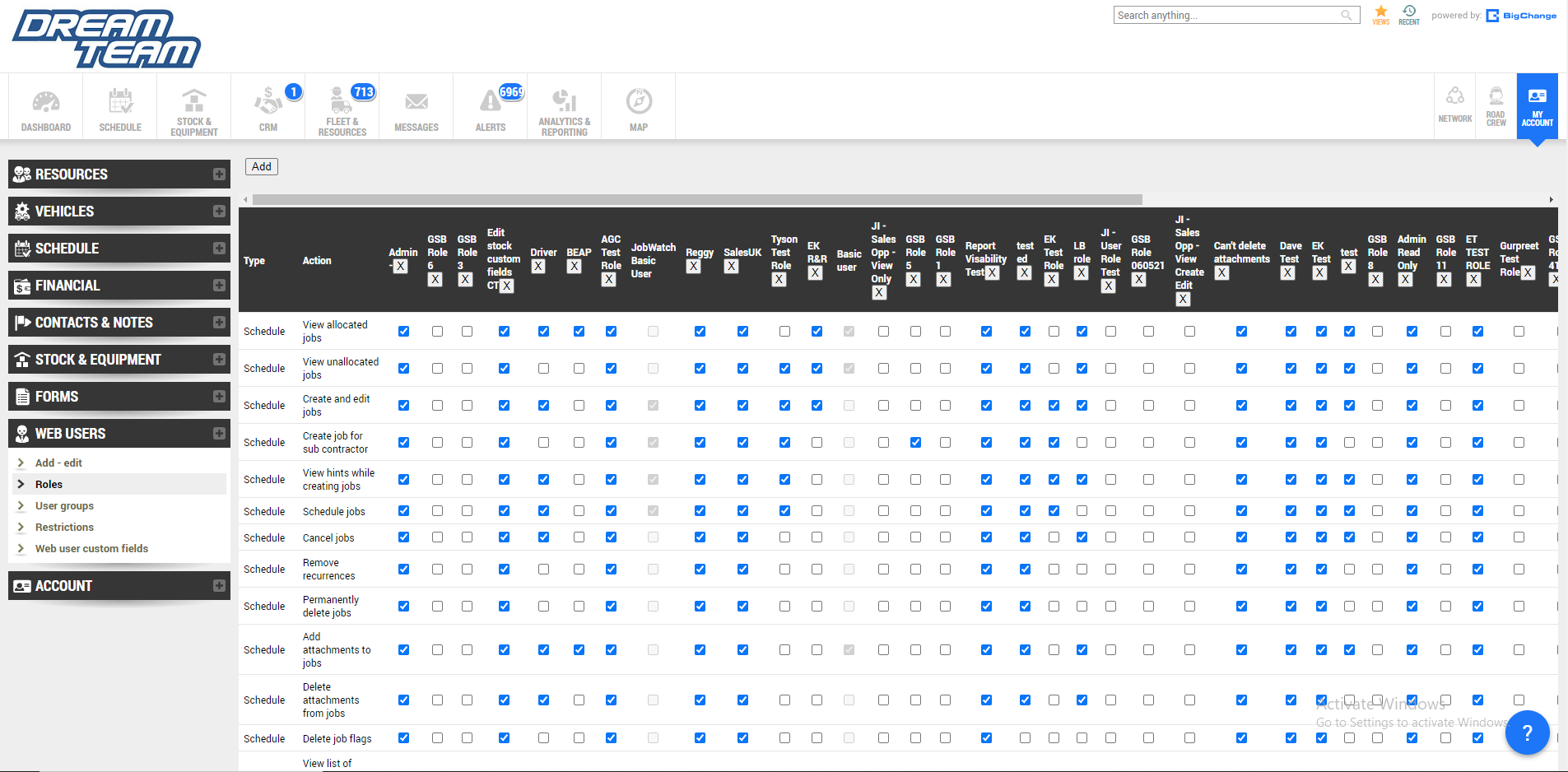
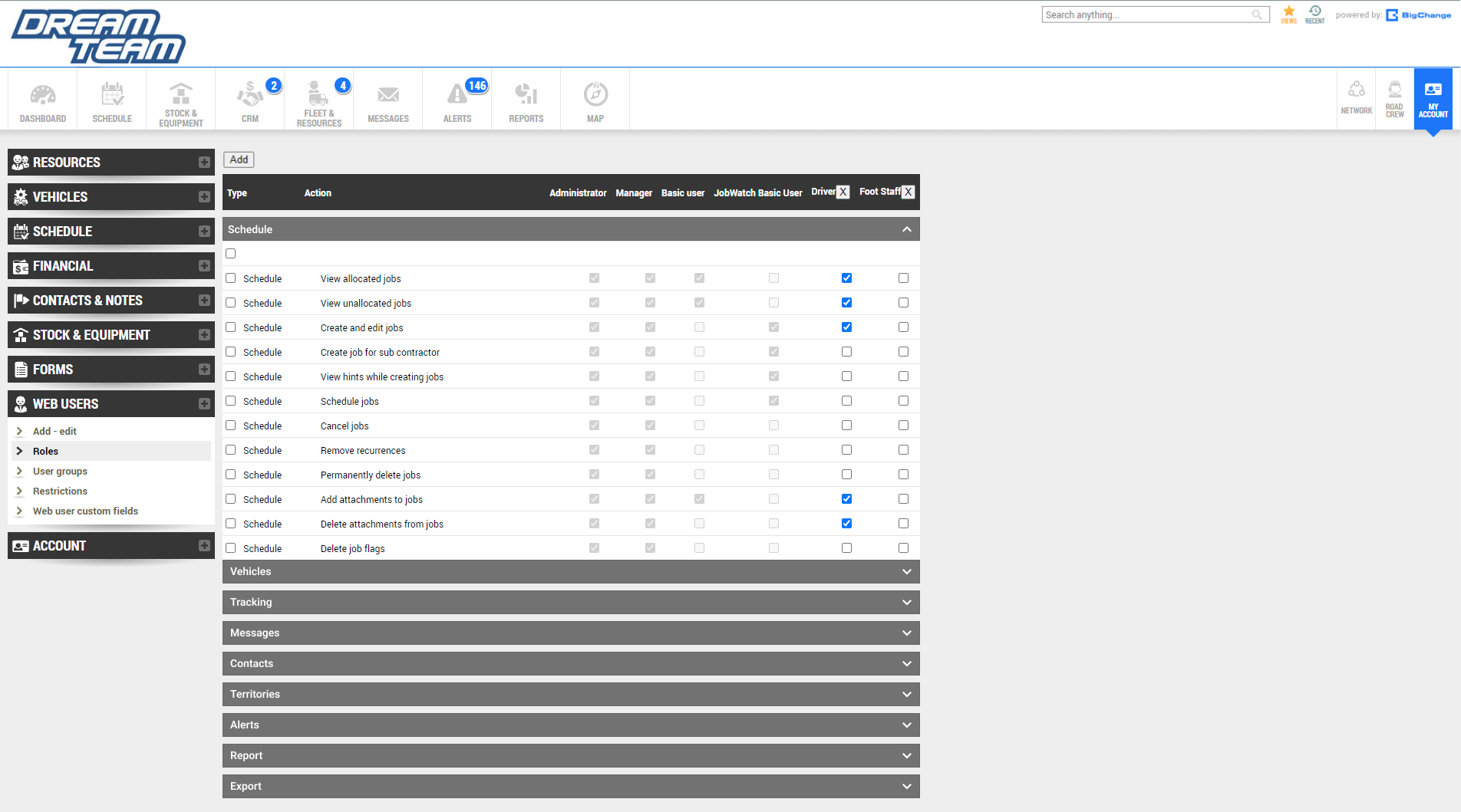
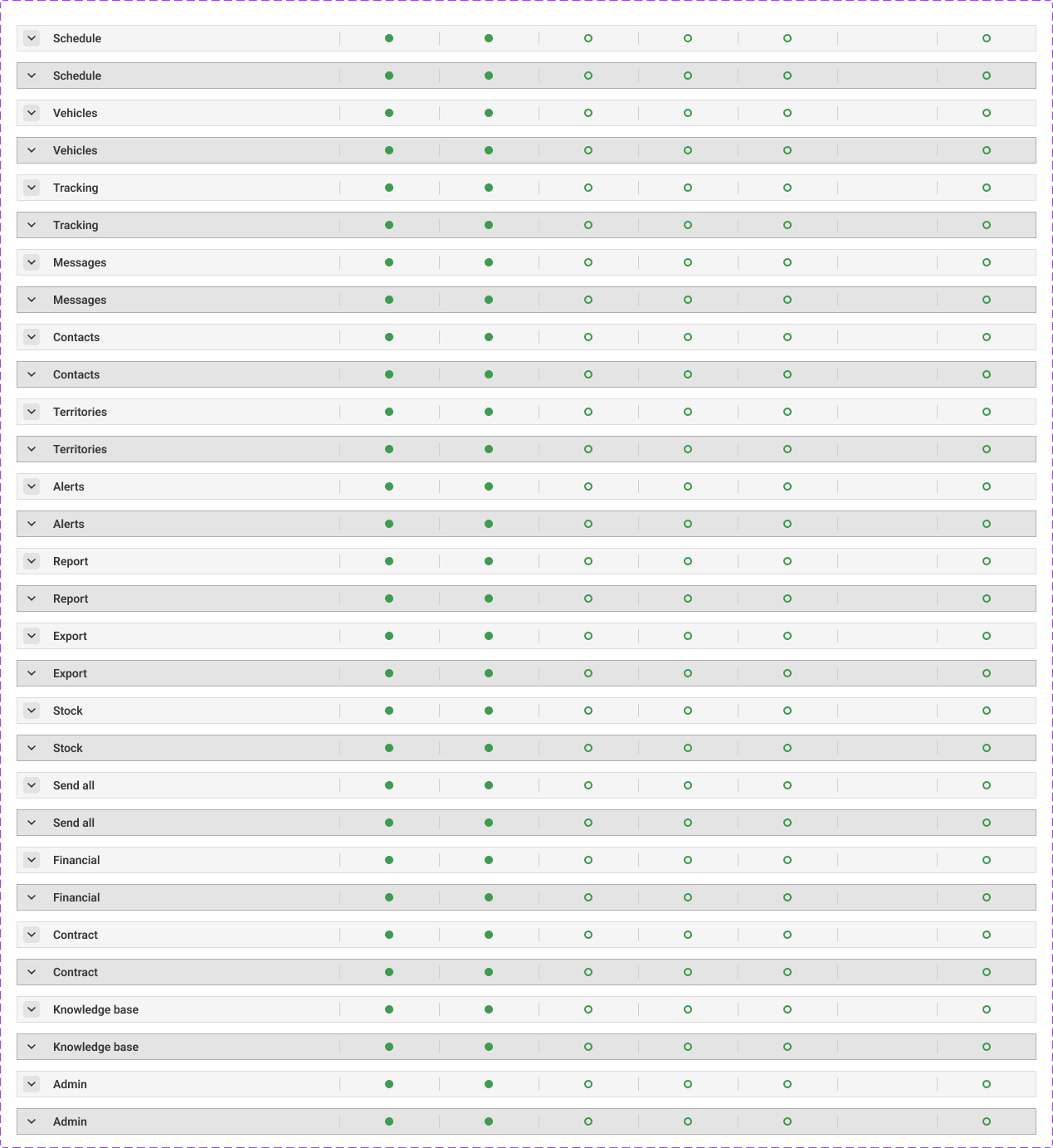
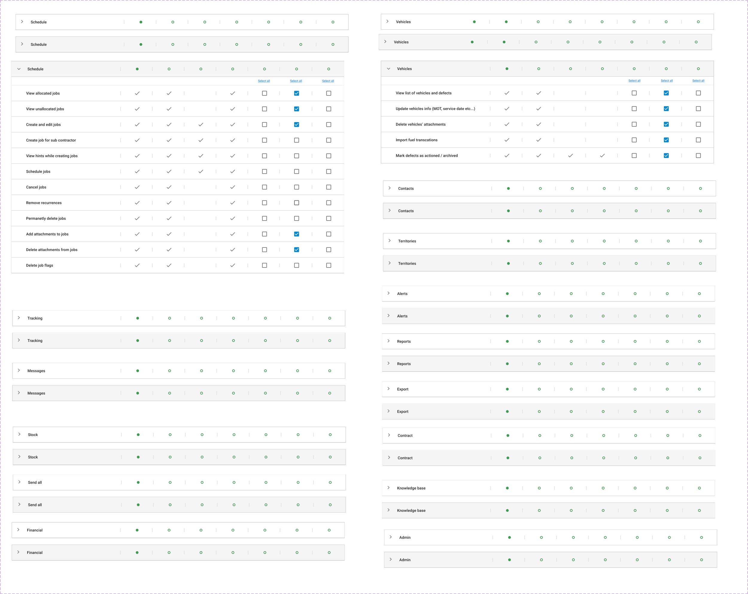
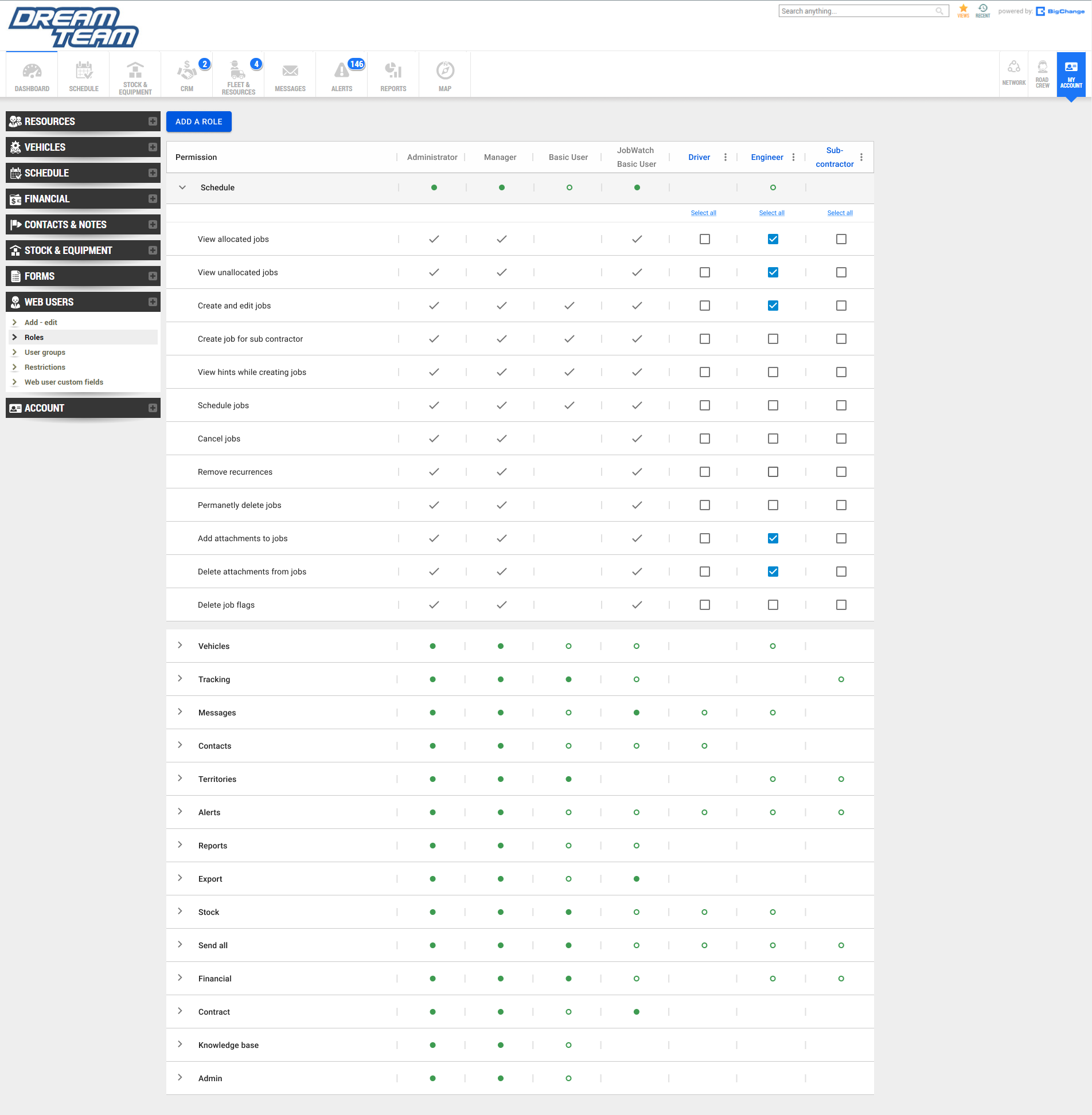
Sorted the ‘type’ into an accordion style menu so users can find their desired permission quickly and efficiently
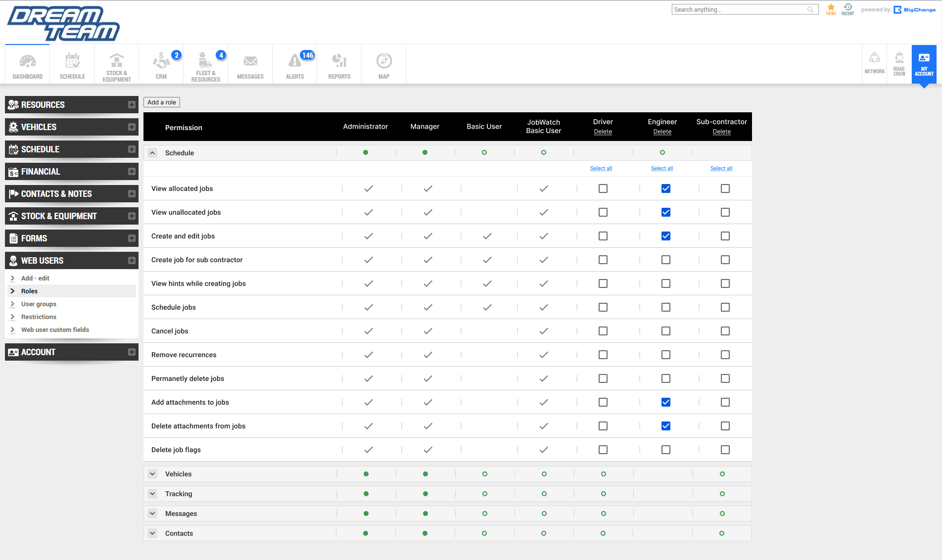
Added a checkbox in front of each permission so users can select them all at once.
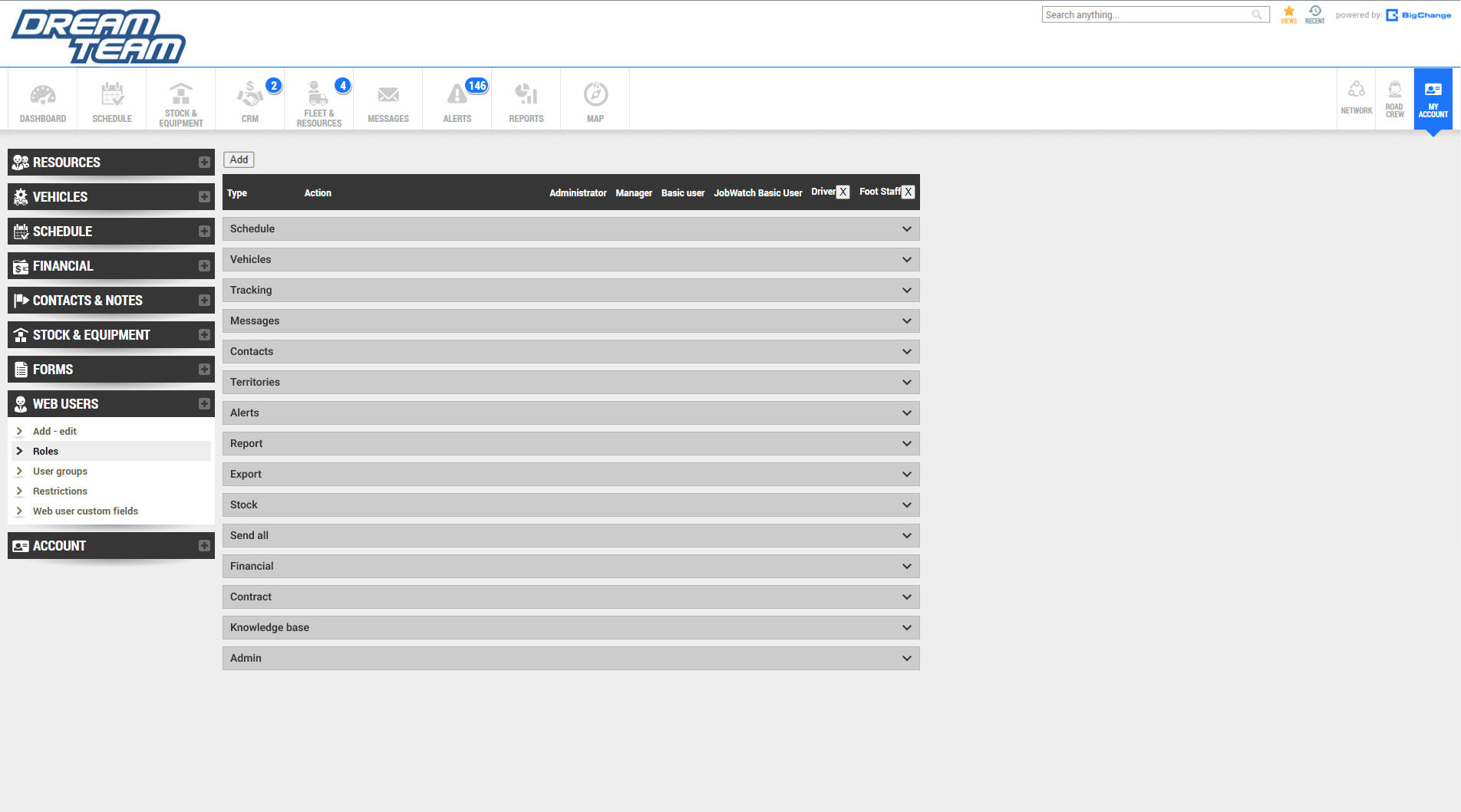
Included check marks and hyphen icons on top of the accordions so users can see which permissions are currently active without having to click on them.
Initial Designs & Wireframes
Refine
Utilised MUI design system components after discussing with developers. This is because the company is transitioning to using Reactjs for building its user interfaces. The MUI design system is part of the React components library. This will help to streamline the process for both designers and developers.
Check mark and hyphen icons are changed to filled green dots or unfilled green dots. Filled dots means that all of the permissions in that column are active. Unfilled means only some are active. Empty means that they are all inactive. This is done in order to create less visual clutter.
Check mark and hyphen icons are now located inside the accordions. This is done to further explain the different states of the green dots in depth.
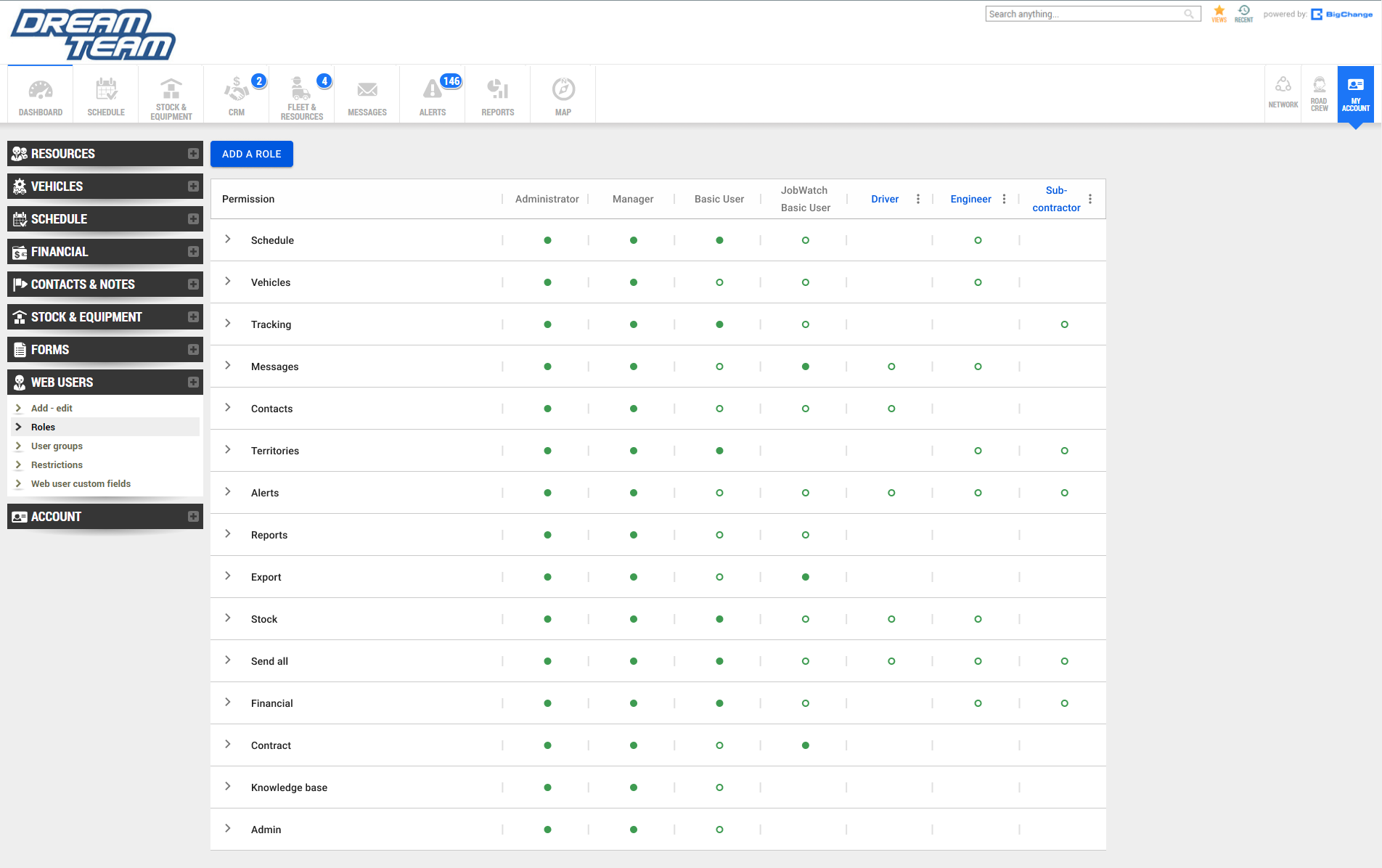
Greyed out permissions for roles that are default to indicate that these cannot be changed.
Included ‘select all’ buttons for editable columns
Developing The Design

Prototype
Changed from grey to white in order to replicate the visual identity of the Import Hub north star design.
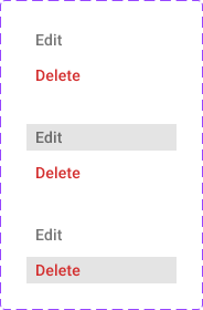
Added hover states which turns the permission from white to grey to indicate that it is being interacted with.
Ellipsis now includes edit and delete overlay as well as its hover states.
Changed the word ‘Type’ to permission.
Default roles are now greyed out in order to signify that they cannot be edited while custom roles are highlighted in.
Finishing touches
Testing
Results
First 30 Days of Launch
-50%
Decrease in average time on task (8min to 4min)
The redesign is now in beta which was released to partnered companies and stakeholders. Testing was also conducted with users.
-70%
Decrease in average mistakes made per task (8min to 4min)
74%
Of respondents said they saw positive results in most their KPI as a result of the clear and structured data.