Import Hub
Importing information is a quick and easy method of moving data from one place to another. This is often used when businesses first start using the platform. Information and data about the business like contacts, jobs, resources, etc, are imported to help users start using the platform with their existing information.
Introduction
Team members
4 Product Managers
3 Developers
2 Product Designers
1 Onboarding Manager
Discovery
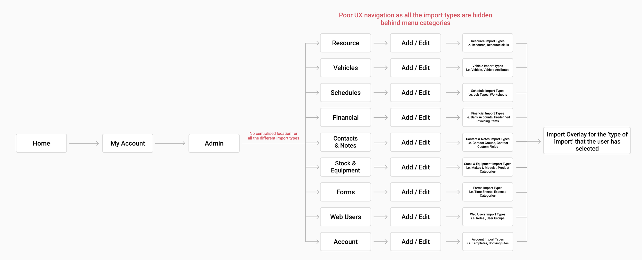
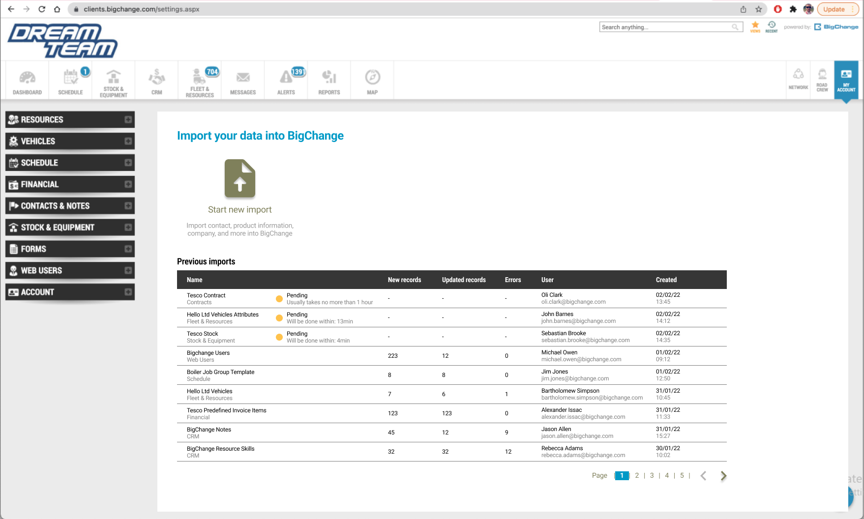
When new to BigChange businesses must import a lot of data. Previously there was no easy way to do this from a single place, and the functionality had a number of usability issues. Before the Import Hub, users would have to individually go into the section of the information that they want to import and select it from there as seen in the user flow diagram below. For example, Admin > Resource > Vehicles > Import
The Problem
In addition to poor navigation to finding import locations, there are many problems that plague the feature itself.
It is difficult for users to be sure that everything has worked as expected or to understand what to do if something has gone wrong. Common pain points such as not knowing the statuses of each import and not knowing if information in the file are formatted corrected would often occur.
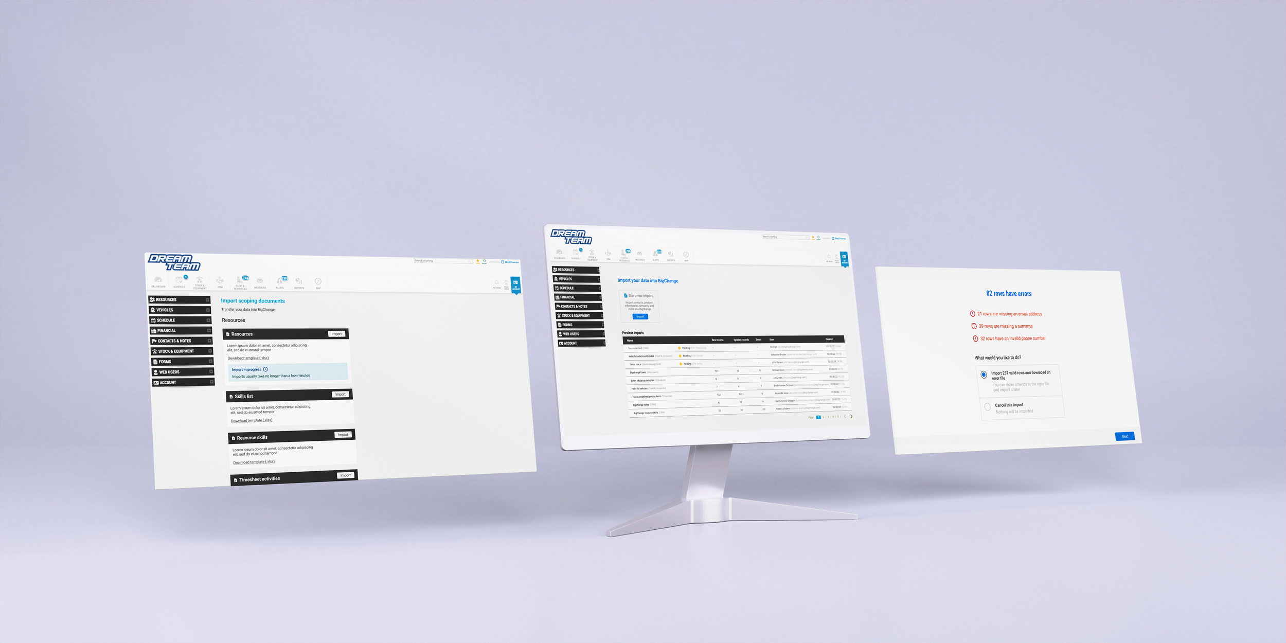
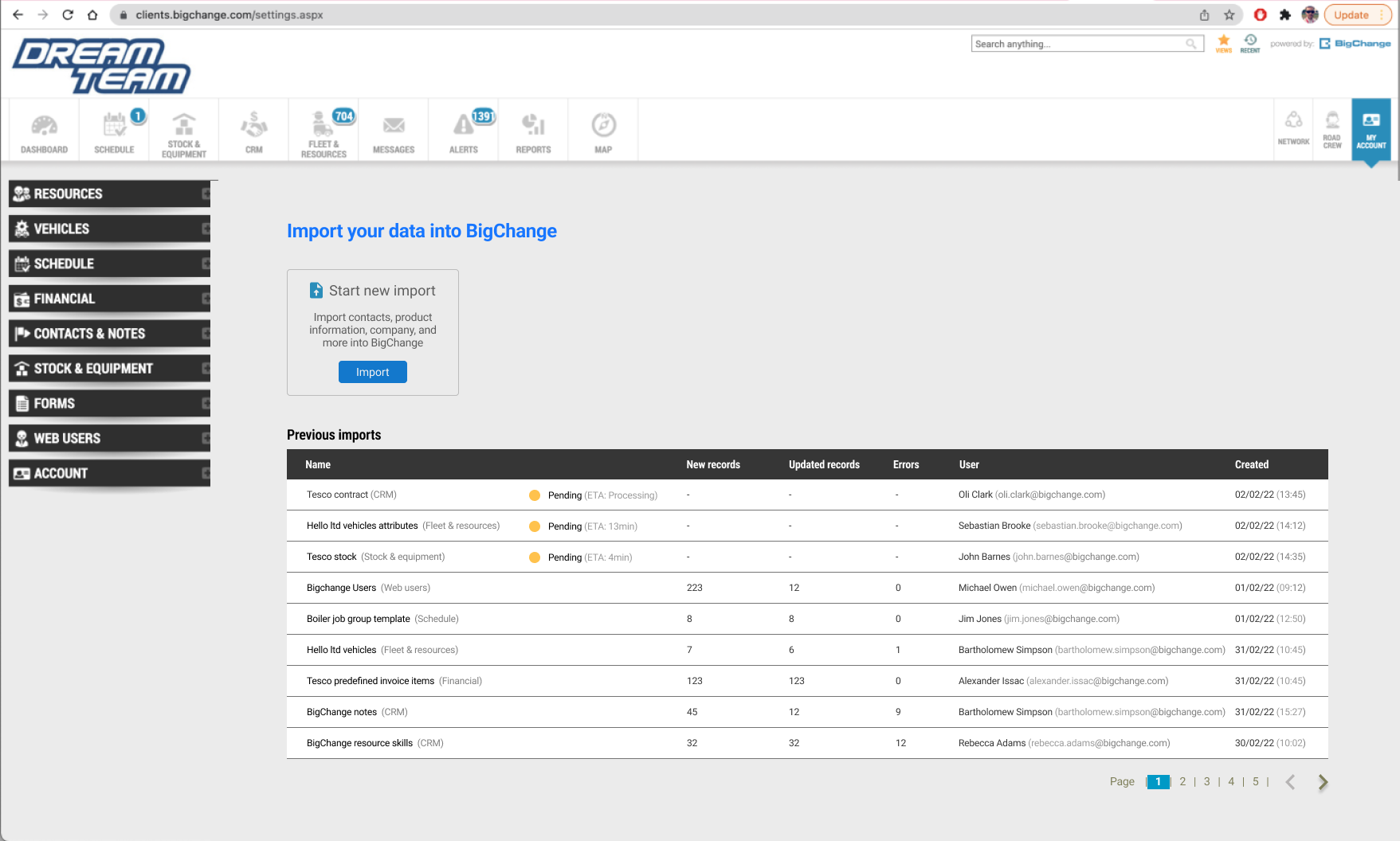
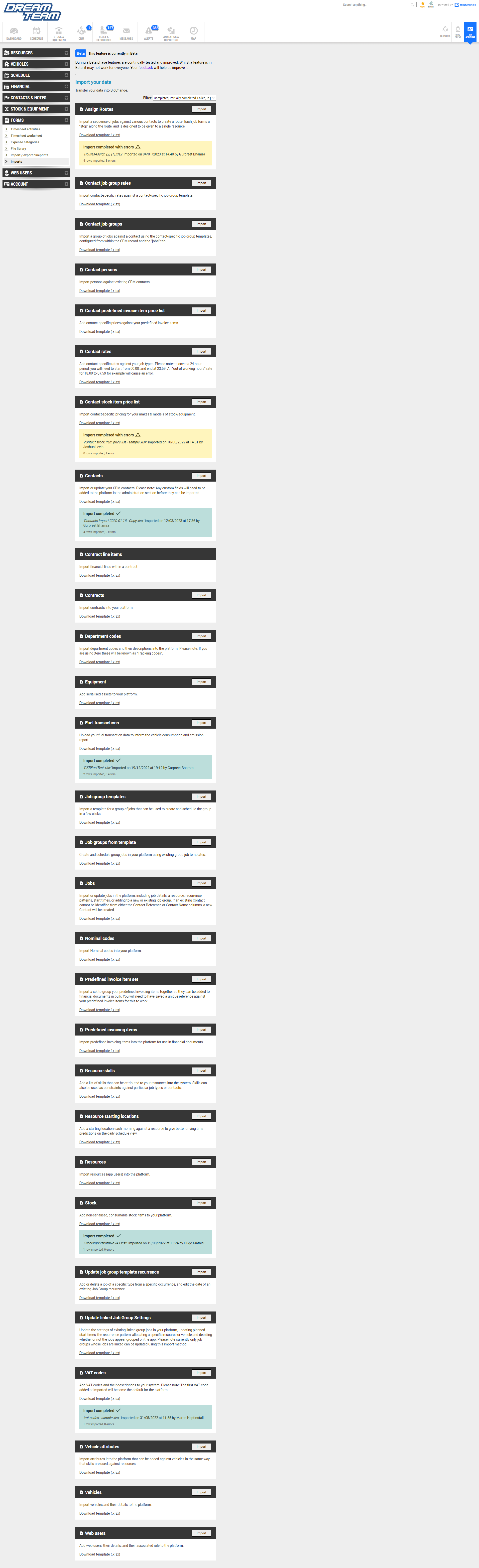
To help with this, we have developed an Import hub, a central place where you can perform imports, download templates and filter by stage or success.
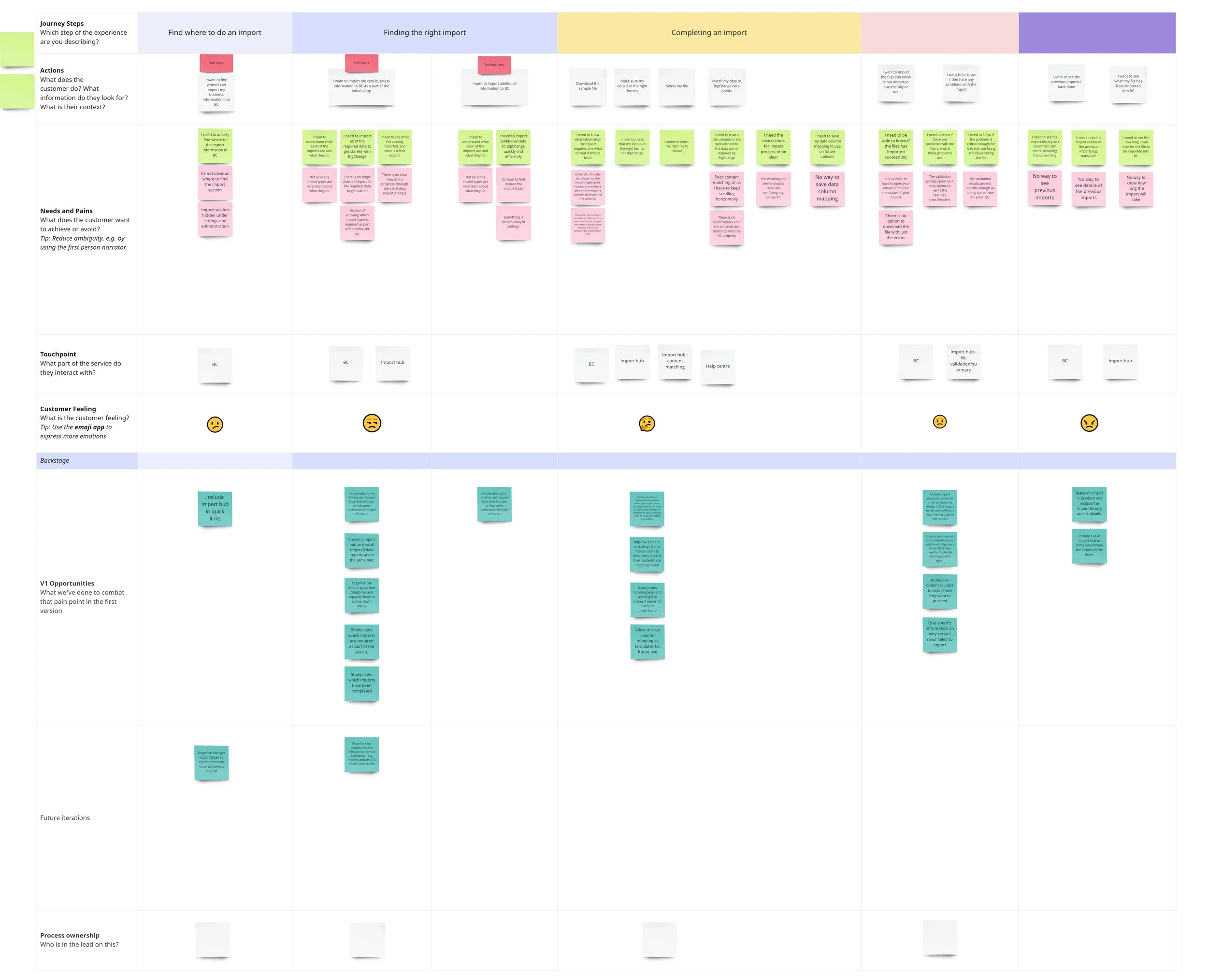
Created user flow of the import process in order to comprehend how users interact with the feature. This will help determind what step users will need to take to complete a task, and how to best lead them through it.
Talking with the onboarding team as they have insights about users pain points and goals
Created a User journey map to analyse research findings in a constructive and comprehensive manner. This will help to figure out pain points and opportunities for improvements.
UX Research
Ideate
Initial design exploration was tested with users and refined.
Centralised location for imports. Includes information of previous imports e.g. status, user, date
Sorted imports into categories.
Progress bar and matching contents of imports.
File validation results
Initial Designs and Ideas
Refine
Center aligned to create an instant impact for users.
The finalised design of the Import Hub would be the north star design that we would iterate towards as it is able to communicate our vision towards the redesign of the product. It retains the familiar brand image of BigChange while revamping through utilising modern UI design elements and techniques.
The borders of drag and drop are dotted to help guide users.
Better usage of iconography to indicate if contents are matching correctly or not.
‘Name your import’ to help identify the import later.
Spinner page included for load times.
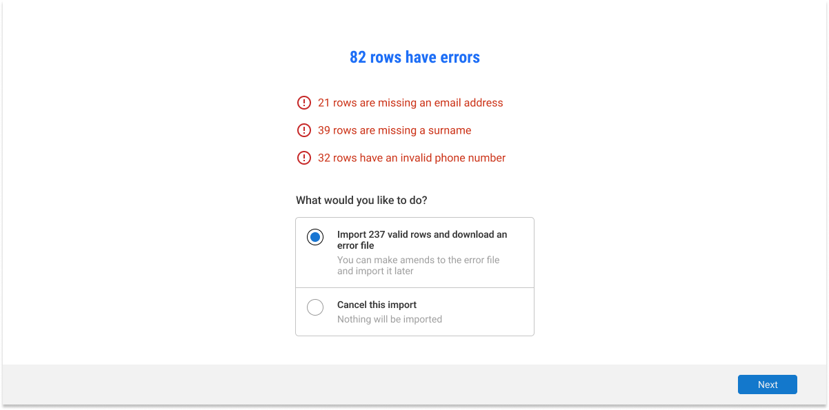
Included results page instead of verification page. This eliminates the amount of information inside the verification page of the previous iteration. It is now replaced with a much easier to digest summary of the results of the import. This includes successful import and imported with errors. Users also now have the option to download the file with just the errors to reload it again.
Developing The Design
Before
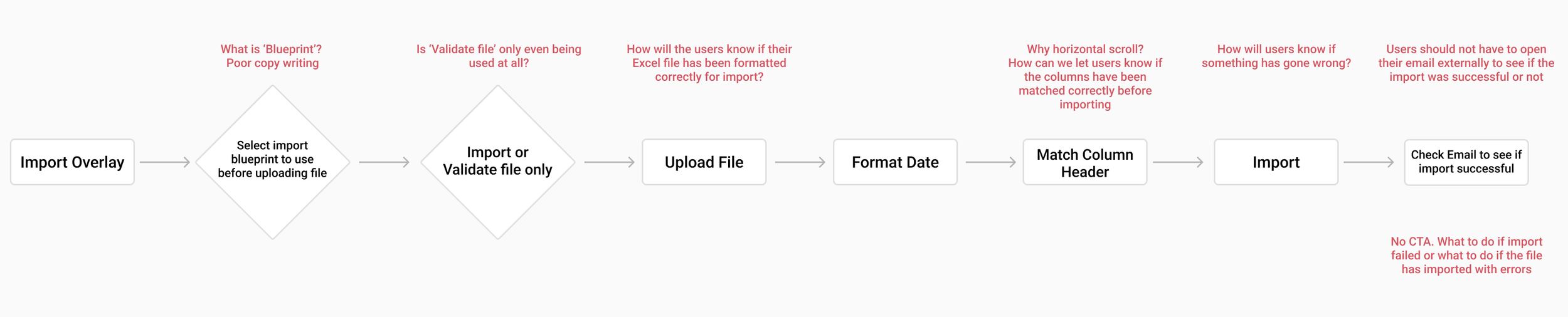
Call to action not clear: In the old UI, the call to action was not clearly communicated to users. It may have been placed in a location that wasn't easily noticeable or lacked visual cues to draw attention, resulting in confusion about the desired action.
Poor copywriting: The copywriting in the old UI was subpar, making it difficult for users to understand the purpose or instructions associated with various features or actions. Unclear or convoluted language could have led to user frustration and misunderstanding.
No way of going back to the previous step without closing the overlay: In the old UI, users didn't have a convenient way to navigate back to the previous step or correct any errors without closing the overlay. This inconvenience interrupted the user flow and made the overall process more cumbersome.
No clear call to action: The old UI lacked a prominent and easily identifiable call to action. This made it challenging for users to understand the next steps or actions they should take.
Poor supporting copy: The supporting copy in the old UI was not effective in conveying important information or guiding users through the interface. It may have been unclear, lacking in detail, or poorly worded.
No history of previous imports: Users were not provided with a history or record of their previous imports in the old UI. This lack of visibility into past activities made it difficult for users to track their progress or refer back to previous work.
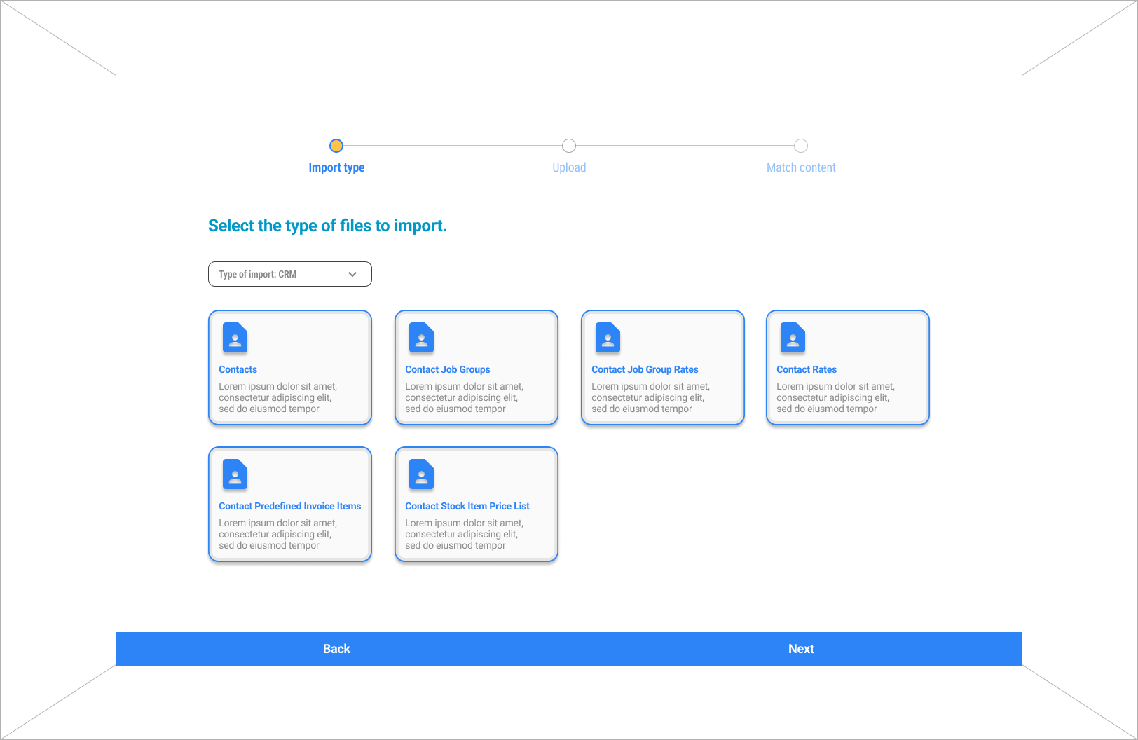
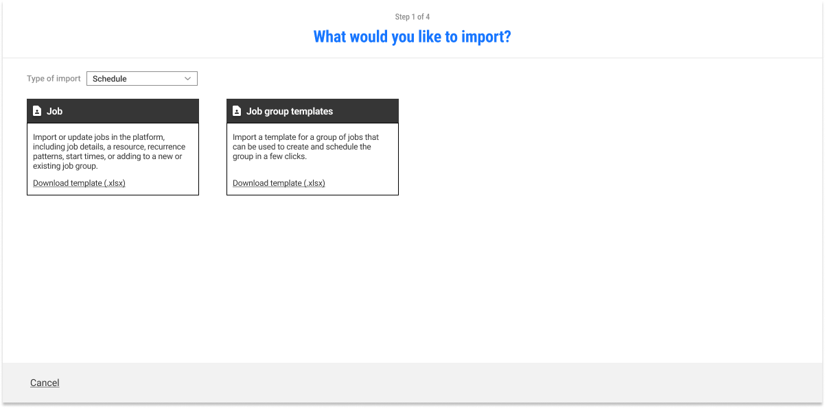
Selecting The Types of Import

Main Import Screen
Clear call to action: The new UI features a distinct and clear call to action that guides users towards their desired actions. This improves the user experience by reducing confusion and providing a straightforward path to follow.
Information and statuses of previous imports: The new UI offers a comprehensive view of previous imports, including detailed information and statuses. This functionality allows users to easily track their import history, refer to past imports, and monitor the progress of their tasks.
Straightforward supporting copy: The supporting copy in the new UI is concise, informative, and easy to understand. It provides users with clear instructions, explanations, and relevant details, assisting them in navigating the interface without ambiguity.
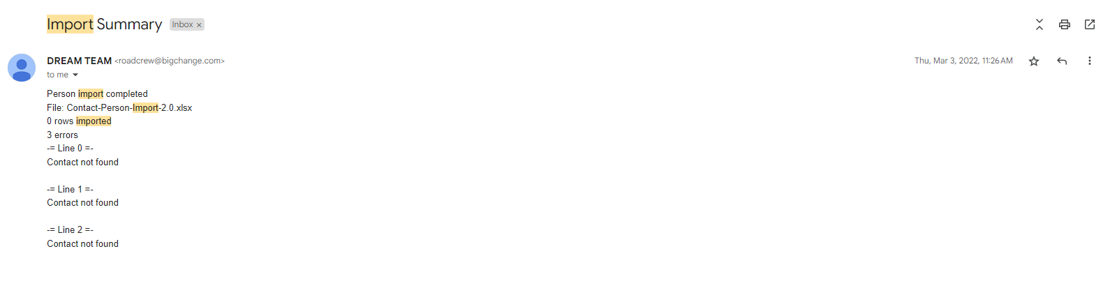
Have to open up email externally to check for results: In the old UI, users were required to open their email application externally to check for results or updates. This additional step created inconvenience and disrupted the workflow, making it less efficient for users to access the information they needed.
Unclear errors: The old UI provided unclear error messages, which made it challenging for users to identify and understand what went wrong during the import process. Lack of clarity in error messages could lead to frustration and difficulty in resolving issues.
No way of knowing what exactly went wrong: Users in the old UI were not provided with specific details or information about what went wrong during the import. This lack of transparency made it difficult for users to pinpoint the exact issues and troubleshoot them effectively.
No clear indication if the import has been done successfully or not: The old UI did not provide a clear indication of whether the import process was completed successfully or not. Users might have been left uncertain about the status of their import, leading to confusion and uncertainty.
After
Checking File
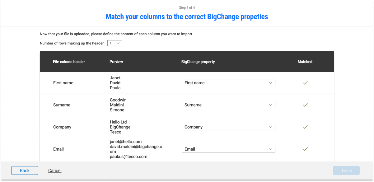
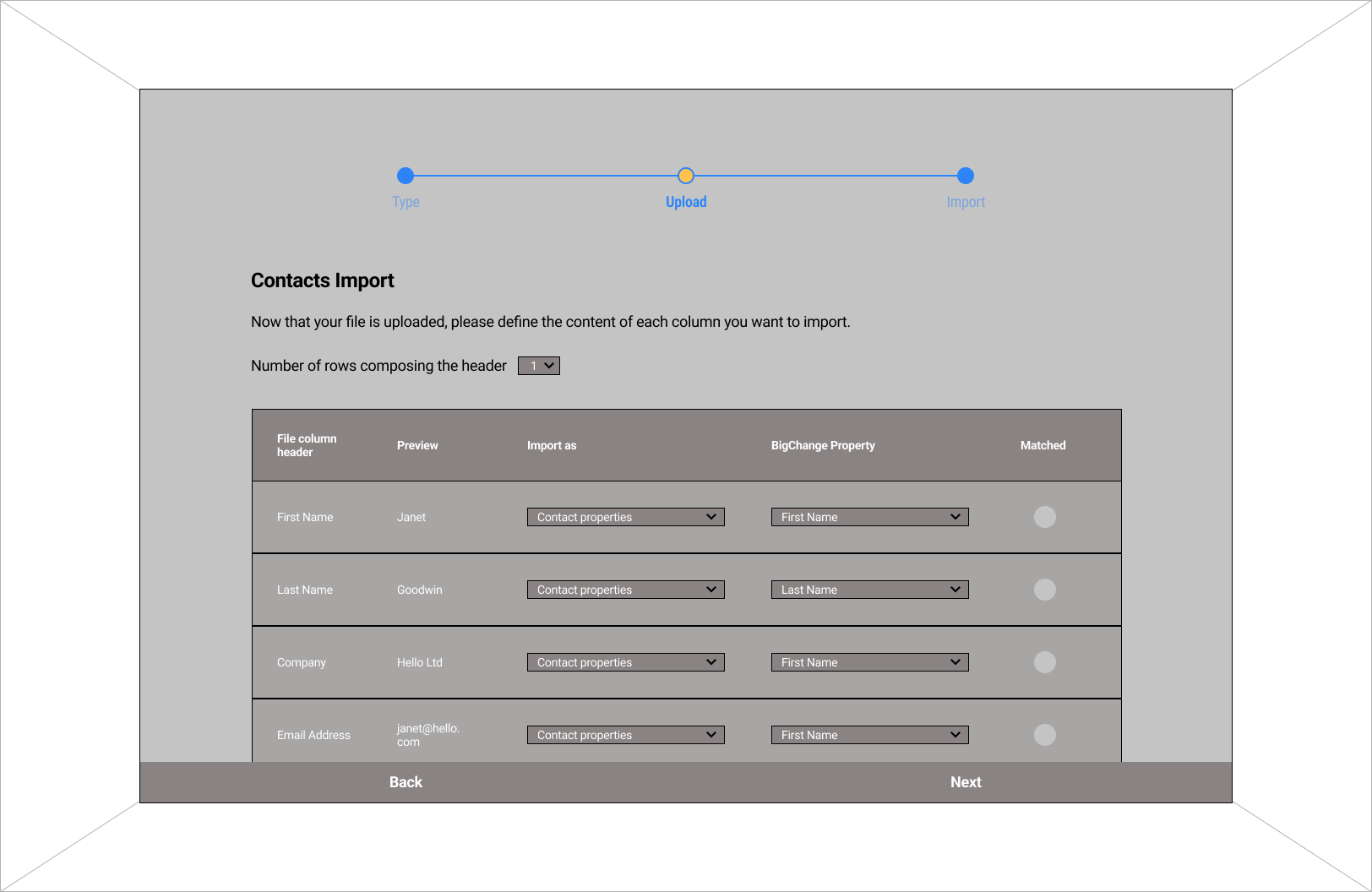
Match Column Header
No clear call to action: The old UI lacked a clear call to action, making it difficult for users to understand what action they should take or how to proceed. This ambiguity could result in a lack of direction and confusion for users.
Long estimate time: The old UI provided users with an estimate of the time required for a process, which might have been excessively long. This extended estimate time could lead to frustration or impatience among users, especially if there was no progress indicator or other feedback.
Supporting copy long and confusing: The supporting copy in the old UI was long and confusing, making it challenging for users to comprehend important instructions or information. Lengthy and unclear text can create a barrier to understanding and increase the likelihood of user errors or misunderstandings.
No indication of if the file is being validated, causing stress: The old UI lacked any indication or visual feedback to inform users if their file was being validated. This absence of feedback could lead to stress and uncertainty, as users wouldn't know if their file was being processed or if there were any issues with validation.
Import Name
N/A
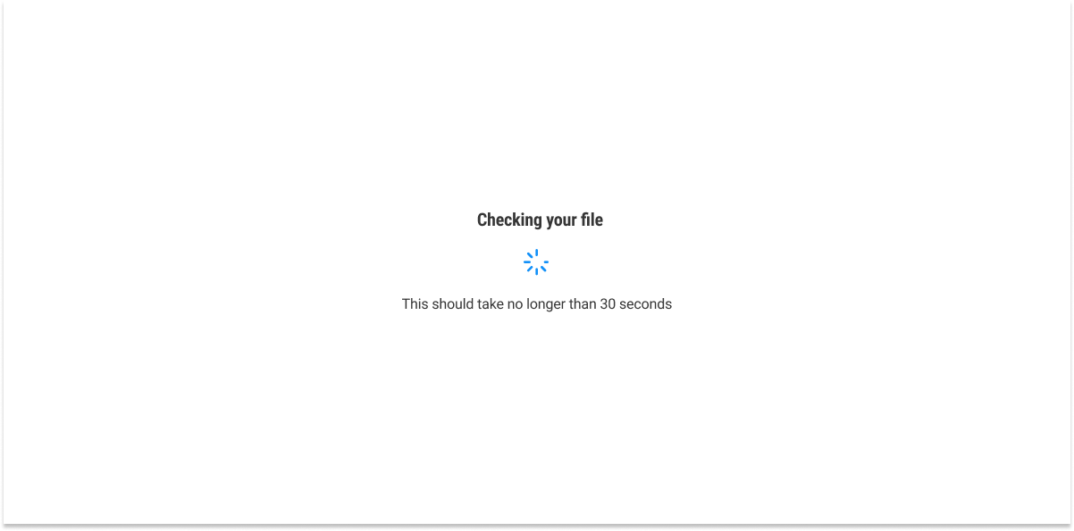
Clear indication of file validation via supporting copy and spinner: The new UI provides a clear indication of file validation through the use of supporting copy and a spinner or progress indicator. This feedback reassures users that their file is being validated, reducing stress and uncertainty during the process.
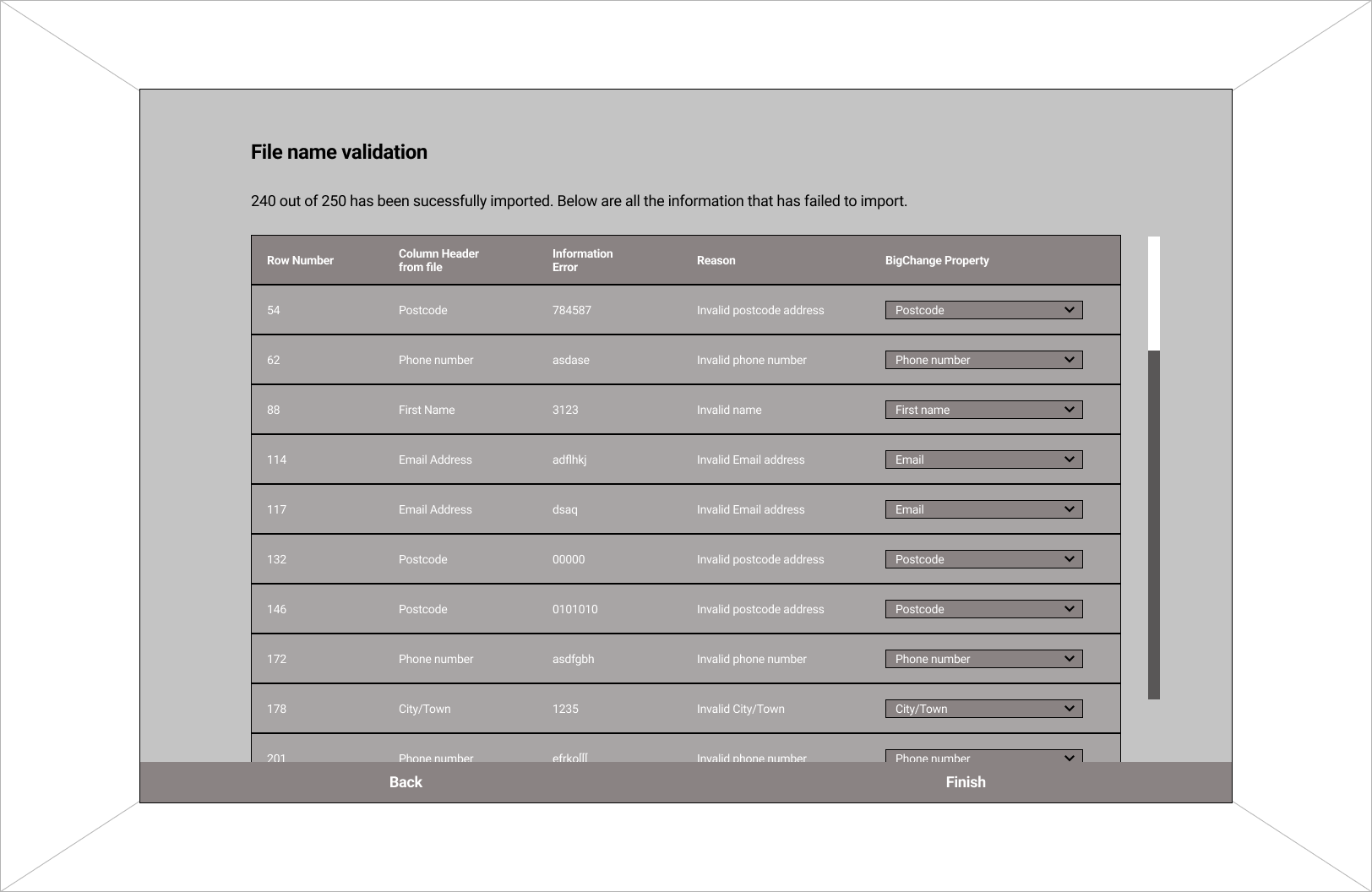
Import Results
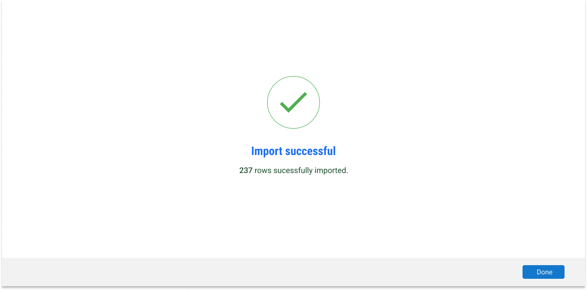
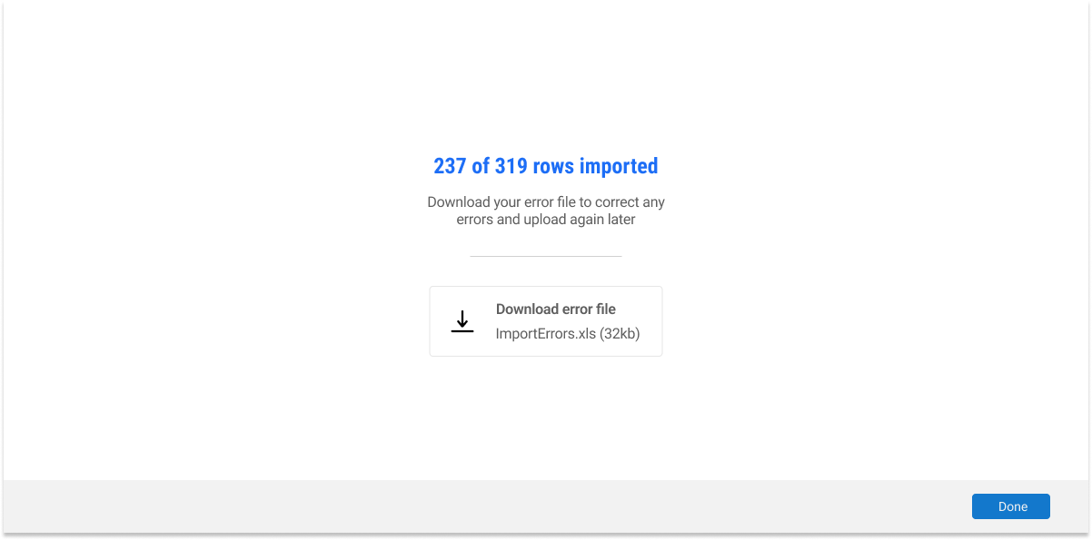
Clear indication of successful, failed, and imported-with-error results: The new UI includes clear indications of the import results, categorizing them as successful, failed, or imported with errors. This immediate feedback allows users to quickly identify the outcome of their import and proceed accordingly.
Clear call to action for handling errors: In the new UI, when errors occur during the import process, a clear call to action is provided, guiding users on what steps to take to resolve the errors. This proactive approach assists users in understanding the next course of action and helps in the error resolution process.
Includes a summary of each error: The new UI offers a summary of each error encountered during the import, providing users with specific details and context. This summary enables users to better understand the issues and take appropriate actions to rectify them.
Options to download the file with errors, import valid rows, or cancel the import: The new UI provides users with convenient options for handling imports that encountered errors. Users can choose to download the file with errors for further analysis, import only the valid rows, or cancel the import if necessary. These options empower users to control the import process and make informed decisions.
Only able to select import types from the selected group: In the old UI, users were limited to selecting import types solely from the selected group. This restricted their flexibility and options when it came to importing data from different sources or formats.
No supporting copy for what each import type entails: The old UI lacked sufficient supporting copy or explanations to guide users on the details and functionalities of each import type. Users might have been left unsure about the implications or specific usage scenarios of different import options.
No way for users to know how to format their file for import: Users were not provided with clear instructions or guidelines on how to format their files for successful imports. This lack of guidance could lead to errors or inconsistencies in data formatting, resulting in import failures or inaccuracies.
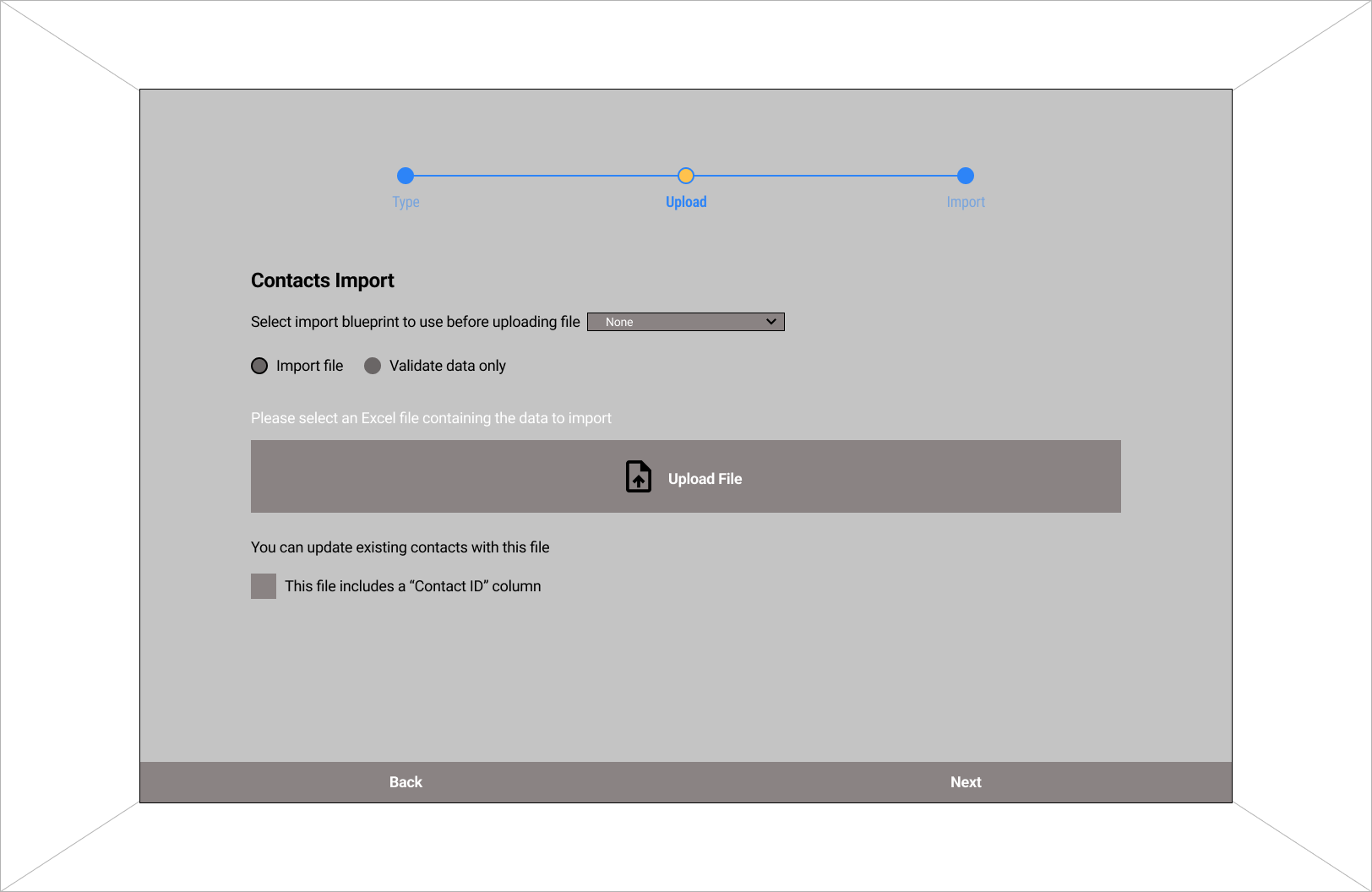
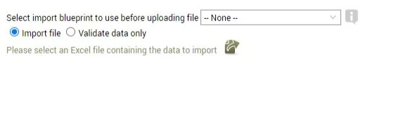
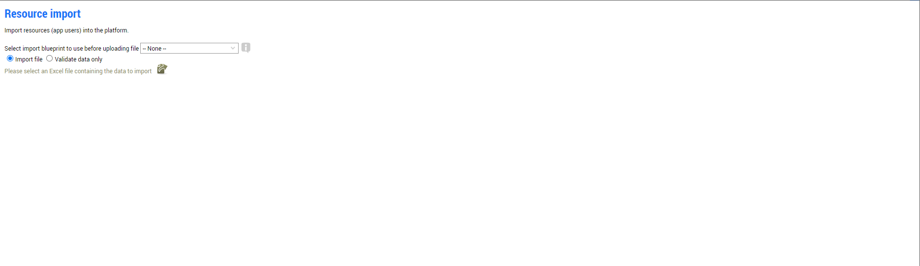
File Upload
Type of imports can be changed via a drop-down menu: The new UI offers an improved feature where users can change the type of import via a convenient drop-down menu. This enables users to select from a broader range of import options, expanding their choices and accommodating different data sources or formats.
Explanation of what each type of import does available via supporting copies: The new UI provides supporting copies or explanations that clarify the purpose and functionality of each import type. This assists users in making informed decisions and understanding the implications of their choices.
Users able to know how to format their file by downloading a template: In the new UI, users are given the option to download a template, which serves as a guide for formatting their files correctly for import. This feature empowers users to ensure the accuracy and compatibility of their data, preventing import errors or data inconsistencies.
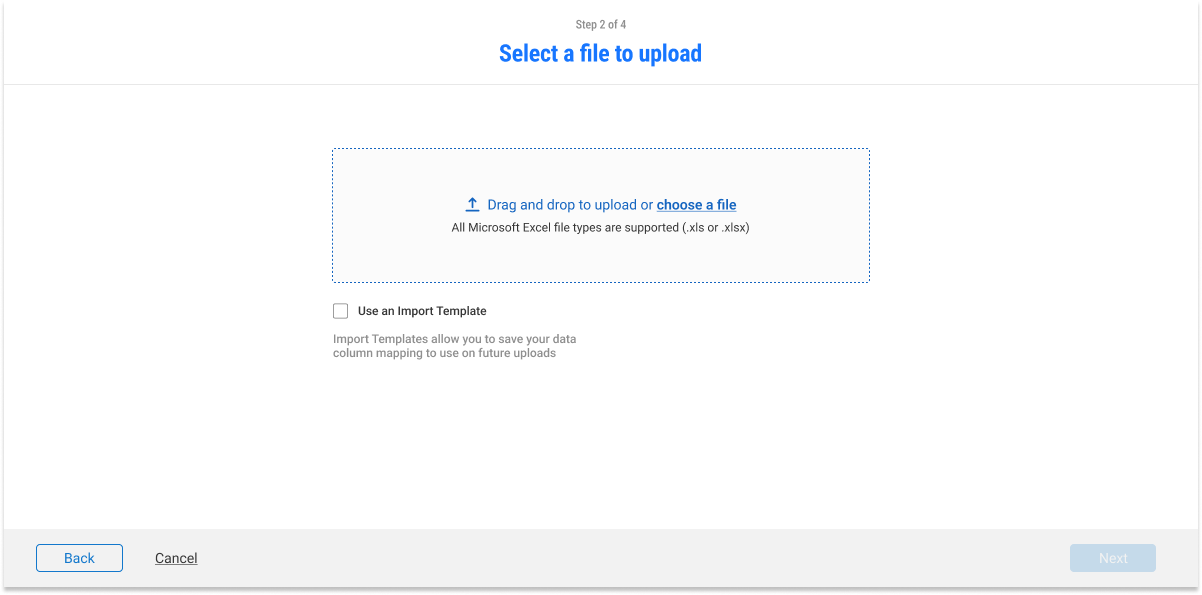
Better call to action with centered alignment: The new UI features a clearer call to action that is visually prominent and centrally aligned. This design choice makes it easier for users to identify the desired action and encourages them to take the necessary steps more intuitively.
Clear supporting copies of what each feature does: The new UI provides concise and informative supporting copies that clearly explain the purpose and functionality of each feature. This clarity empowers users to make informed decisions and utilize the available options effectively.
Users will now know exactly what type of files are accepted: In the new UI, users are provided with explicit information regarding the types of files accepted for various actions or features. This eliminates any guesswork or confusion and ensures that users select the appropriate file formats for successful operations.
Improved navigation with numbered steps, back and next buttons: The new UI incorporates improved navigation elements, such as numbered steps, back buttons, and next buttons. These additions facilitate a more seamless user experience, allowing users to easily backtrack, correct errors, or progress through the interface in a logical and intuitive manner.
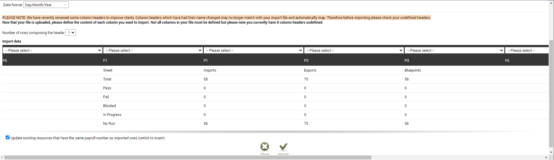
Horizontal scroll interrupting the flow of the UI: In the old UI, the presence of a horizontal scroll may have disrupted the flow of the interface. Users would have to scroll horizontally to access content, which can be inconvenient and disrupt the overall user experience.
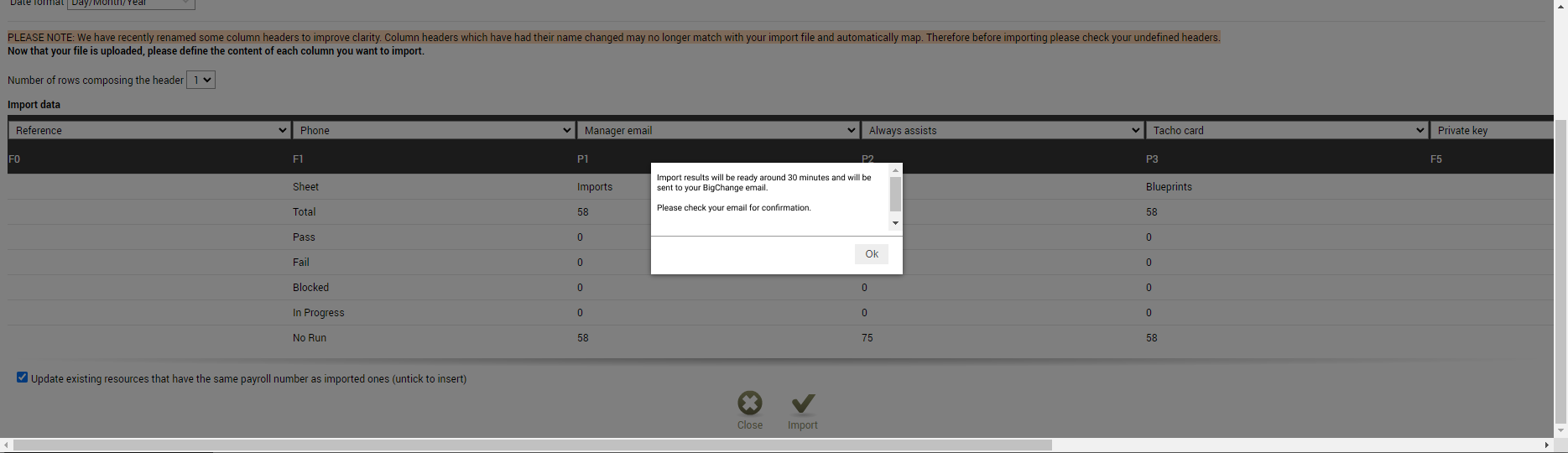
No way of knowing if the contents have been matched correctly: The old UI lacked a clear indication or feedback mechanism to inform users if their content had been matched correctly. This lack of feedback could result in uncertainty and potential errors during the import process.
Poor labeling of column headings (P1, P2, etc.): The column headings in the old UI were not effectively labeled, potentially using generic or cryptic labels such as "P1" and "P2." This labeling approach can confuse users and make it difficult to understand the content or purpose of each column.
Vertical scroll improving the flow of the UI: The new UI utilizes a vertical scroll, which improves the flow of the interface. Users can scroll vertically to access content, resulting in a more intuitive and uninterrupted user experience.
Included 'Matched' to help users identify if their contents have been matched properly before importing: In the new UI, a helpful addition is the inclusion of a 'Matched' indicator. This feature allows users to easily identify if their content has been matched correctly before proceeding with the import, reducing the likelihood of errors or incorrect matches.
Clear labeling of the headings: The new UI implements clear and descriptive labels for column headings, improving the clarity and understanding of the content within each column. This labeling enhancement makes it easier for users to comprehend the purpose of each column and work with their data more effectively.
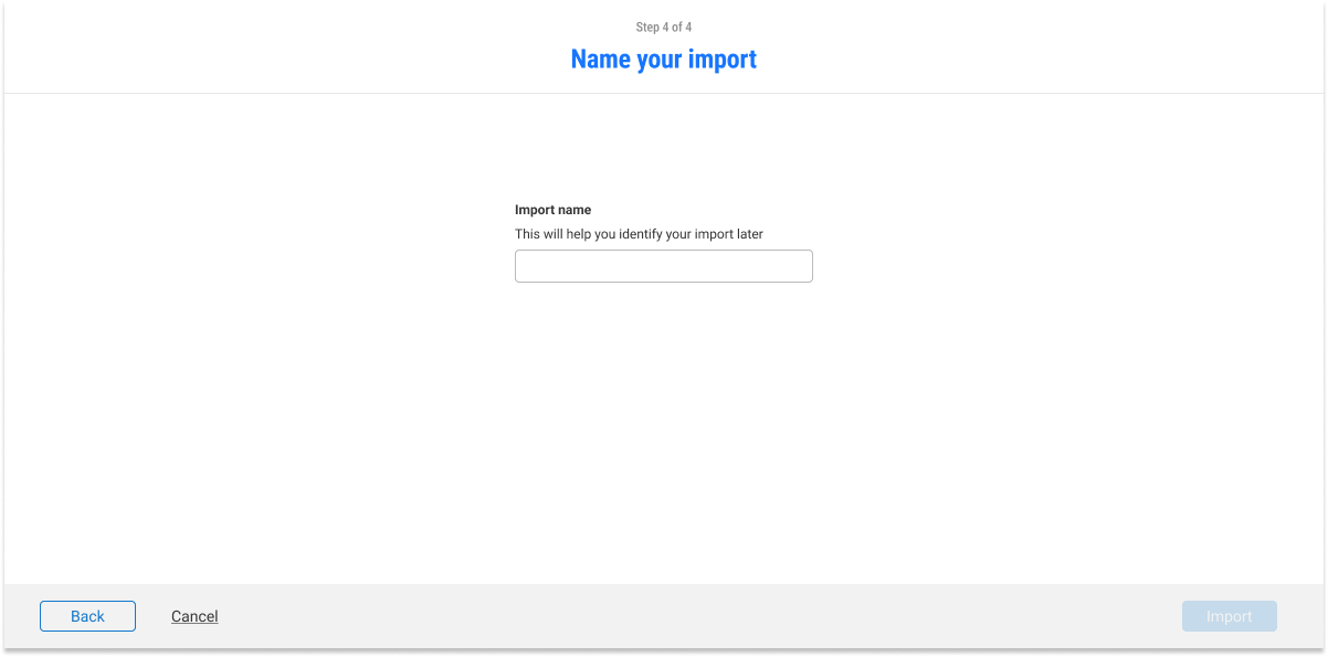
Letting users name their imports so that they can identify it quickly later.
First Time User Import
I included a page for first time users, the MVP of this project as it gave first time users the most value. The feature helps first time users know which information is essential for first time data imports. This eliminates the hassle of going through specifics and removes the required knowledge to know which types of imports are needed for them to start using the platform. Thus, hugely removing the time on tasks for users.
MVP
〰️
MVP 〰️
MVP
〰️
MVP 〰️
The Import Hub is now in beta and is one of the newest feature to be put on the site!
Test
Results
First 30 Days of Launch
62%
Increase in pageview (80 to 172)
-51.11%
Decrease in average import time (45min to 23min)
211
Onboarded users within 30 Days